Above the fold: Email Marketing best practices to be debunked or a timeless rule?

We have kept the focus of key message content in the above-the-fold part for years in our articles about Email Design.
In 2021, we questioned the validity and current relevance of this mantra. We wanted to know if it’s still a key best practice or, as trends and market logic have changed, has become outdated.
Keep reading the article to find out our results!

From developing integrations to strategic support, from creating creative concepts to optimizing results.
What is above the fold and why does it matter?
Above the fold refers to “the upper part.” But what does it mean? It refers to the split of a traditional newspaper into two parts for arranging and displaying it to the public. Precisely for display purpose, the newspapers’ double folding historically determined the choice of placing the main news of the day above the fold. This way, the most important headline gained visibility, leaving content of minor relevance in the hidden part.
Email Marketing has borrowed this concept to indicate, in its digital version, an imaginary fold that divides the message into two sections:
- the section above the fold contains everything that’s immediately visible to the user when the message is opened
- the section below the fold instead requires the user to scroll the message to view it
Hence, a long-established Email Design best practice is to check that the key content of the message (purpose, main news, call to action, conversion lever, etc.) are placed in the above-the-fold part, keeping secondary and associated content in the below-the-fold part.
Further, it’s key to always ensure an overall balance of the email. The top part shouldn’t take up too much space, thus disrupting the message’s layout harmony.
Above the fold: is this still a valid rule?
A Nielsen Norman Group study substantially anticipated in 2018 that people are much more accustomed today than in the past to scrolling apps, social networks, and web pages. This certainly has consequences, even in the field of Email Design.
Applications like Instagram and Tik Tok have accustomed users, and keep doing so to an increasing extent to continue further in viewing and scrolling content for prolonged times. This gesture has now become a mechanical habit. Just think of the concept of infinite scrolling. The gesture contributes to the release of dopamine and serotonin in the body while stimulating the user’s curiosity. It lubricates an almost uncontrollable and irrational automatism. Add to this the rise of doomscrolling during the pandemic: possibly, we’re increasingly moving towards a digital world of users who are used to sliding their fingers on a screen, looking for news or content that can impress, influence, and satisfy…
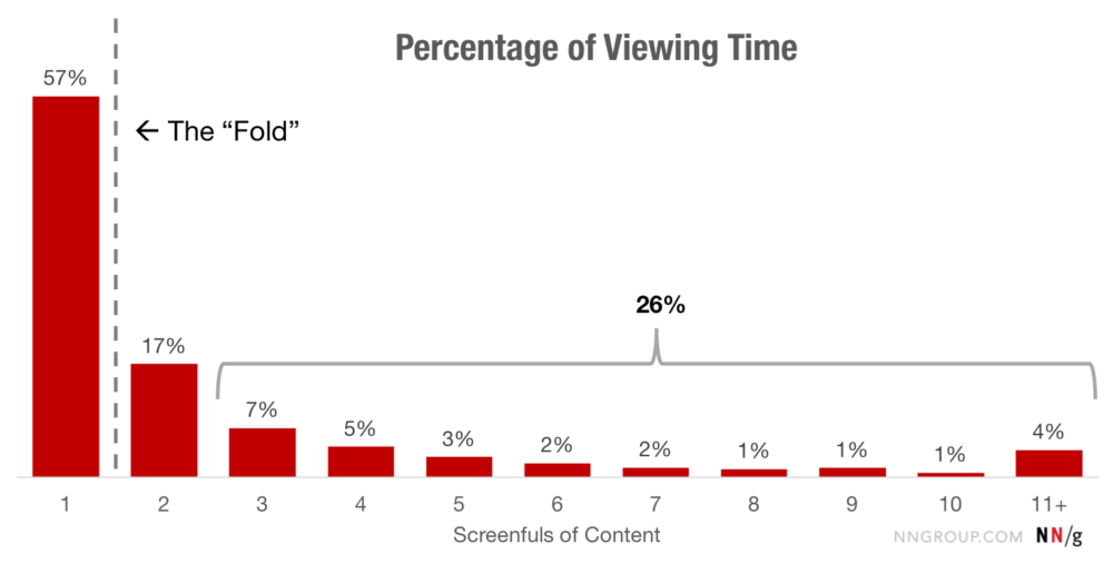
By 2017, the Nielsen study showed that users spent about 57% of a page’s display time focusing on the above-the-fold part. 74% of the time is spent on the first two top sections of a page or message:

In 2010, 80% of viewing time was dedicated to the above-the-fold section. The change in recent years has been tangible. This means that the above-the-fold part is no longer as relevant as in the past.
We could say that the fold line is dropping a little, while the attention threshold is widening to include sections beneath the fold. The 80% of viewing time, once devoted to the above-the-fold part, now encompasses the first three sections of a page or message. Furthermore, in 2010, the below-the-fold part shared only 20% of viewing time. Today, this percentage has gone up to 43%.
What can we conclude from that?
The main conclusion to be drawn is that the above-the-fold rule is no longer as relevant and binding as in the past. As a result, the email’s key concept section has expanded, including the lower message sections.
We can then readjust the above-the-fold rule within the following key principles:
- Give relevance to the key content of the message by using every element of Email Design at your disposal. These include fonts that capture the user’s attention, the most suitable colors, and visuals, as well as a subject line and a preheader that “leap off the screen.”
- The user scrolls the message if sparked to do so. So think of a strategy (such as special storytelling, structure, type of visual, etc.) to increase user curiosity. Accompany and spur them to look beyond the fold. There are endless ways to facilitate scrolling. Look at this email, for example:

- take advantage of all the formatting rules and provide content with a clear hierarchy. This will make the message more readable and its scanning easier.
- always test the message. Use the A/B test as a basic rule to verify the winning structure. Ensure that the user will be prompted to view and click the main content of your message.
What’s your opinion? Is the above-the-fold still a valid rule? Leave a comment, and let us know your opinion!