5 formatting rules to improve the readability of emails and landing pages
Did you ever wonder how your users read the content of your emails and web pages?
If so, you may have found the enormous amount of studies on the cognitive mechanisms by which humans view, read, and learn web content. If the answer is no, you’ll be amazed about the fact that users rarely read a whole web page or message: only 16% of people dwell on every single word, and overall, people read only 20% of a page’s content. Reading becomes even more scattered and rushed when it comes to newsletters, and gets even worse when switching from the desktop to the small screen of a smartphone. Mobile devices, in fact, slow down the ability to grasp a more complex text.
These aspects help in understanding why it’s key to dwell not only on the readability of a text but also on its legibility. We must format content so that text is clear and easy to scan at first sight.
Let’s see how to make your emails and landing pages easier to read with the help of some simple rules.
1. Avoid unique text blocks
A long wall of text without interruptions or sections is the main obstacle in reading content.
Therefore, the first rule of thumb is to create different sections within the text and divide them into paragraphs (even sub-paragraphs, if necessary), each relating to a specific idea/subject. This way you’ll get three results:
- lighten the visual impact of your page or email text
- allow users to switch to the next paragraph if they already know or find the current topic irrelevant
- speed up the overall reading of the text, making it easier to scan the page
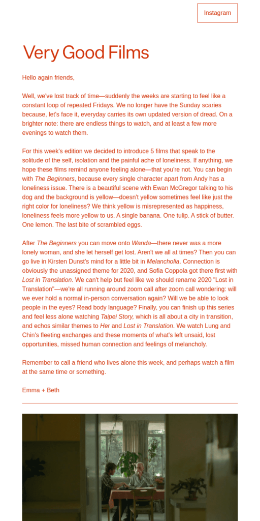
For example, this email shows a long text with no subheadings and no diverse font formatting. Wouldn’t this type of message have been much harder to read if it didn’t have paragraph distinction and visual text separation?
After this step, consider highlighting these text sections even more by providing paragraphs with different indents. This not only makes them clearly identifiable, but can also increase the text dynamism, as shown in this GIF:
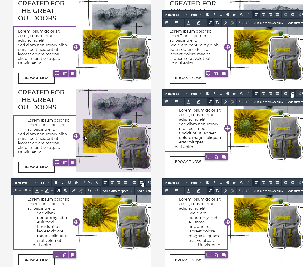
This sequence of images displays a message with different indents. These enliven the text block, which becomes a sort of frame to the image itself. This GIF also demonstrates how the MailUp platform BEE editor makes indentation management easy and quick. Just go on the relevant section text block formatting toolbar and click on the paragraph indent button.
2. Insert headings and subheadings, and assign a hierarchy to the content
You’ve created your paragraphs. The next important rule to improve text readability is providing the message or page sections with subheadings (if needed), optimizing their effectiveness and clarity (be short and to the point), and giving them a hierarchy with appropriate heading tags (H1, H2, and H3).
This is a key step in optimizing the content from both a SEO and an aesthetic point of view. It improves the visual impact and eases scanning, as in this case:
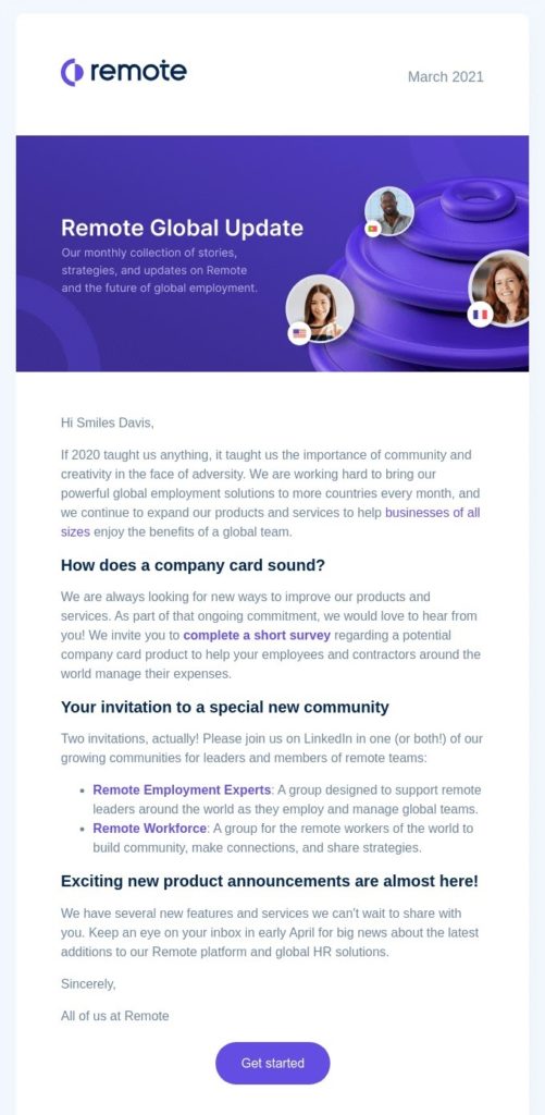
This example shows a text split into paragraphs that also has headings (H2s, in this case) for each section. These illustrate the topic and allow the user to grasp the main subjects of the message at first glance.
One of the latest innovations in the MailUp BEE editor has facilitated the insertion of heading tags into your emails and landing pages.
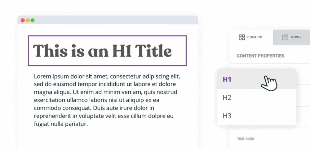
Just add the relevant content block in the message body and select the kind of heading tag you want to insert (H1, H2, or H3), as shown in the image:
3. Harness the power of bulleted lists
Bulleted lists are possibly one of the most effective tools to lighten a text and instantly convey the main concepts of a message.
These two examples show how the same text can radically change just from this trick.
Option 1:
“Our Gold holiday package includes a 2-night stay in a Deluxe Room with a balcony and a whirlpool; 2 free, 3-hour sessions at the wellness center, including a 60-minute massage and facial treatment; a welcome drink; breakfast buffet, and the chance to rent 2 bicycles for free.”
Option 2:
Our Gold Vacation Package includes:
– 2 nights in a Deluxe Room with a balcony and a whirlpool
– 2 free, 3-hour sessions at the wellness center + a 60-minute massage and facial treatmen
– a welcome drink
– breakfast buffet
– free bike rentals
You may have noticed that option 2 is objectively much easier to read, understand, and memorize. In fact, the bulleted list highlights the key elements of a message and visually creates immediate focus points for the reader’s eye.
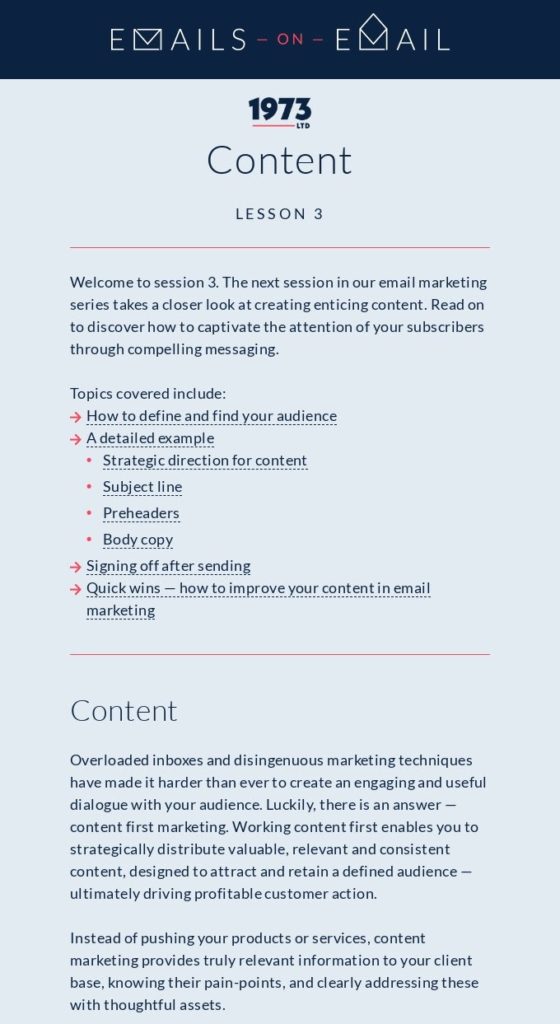
For example, take this email: the bulleted list breaks up the text block and makes it less heavy when glanced at:
Obviously, there are several ways to make a bulleted list, depending on the need and the type of content:
- adopt numbering (this suggests a chronological order or emphasizes the total number of points in the list)
- use bullets (this is the most universal choice and fits any type of list)
- use letters (good when it comes to a quiz with different answer options)
The BEE editor lets you set and choose different types of lists by simply expanding the dedicated button:

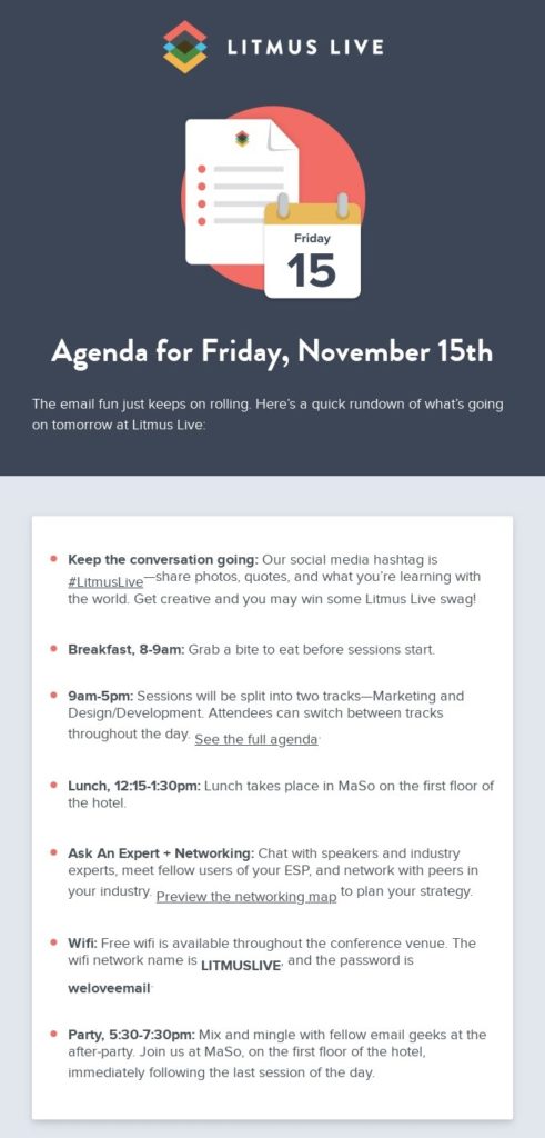
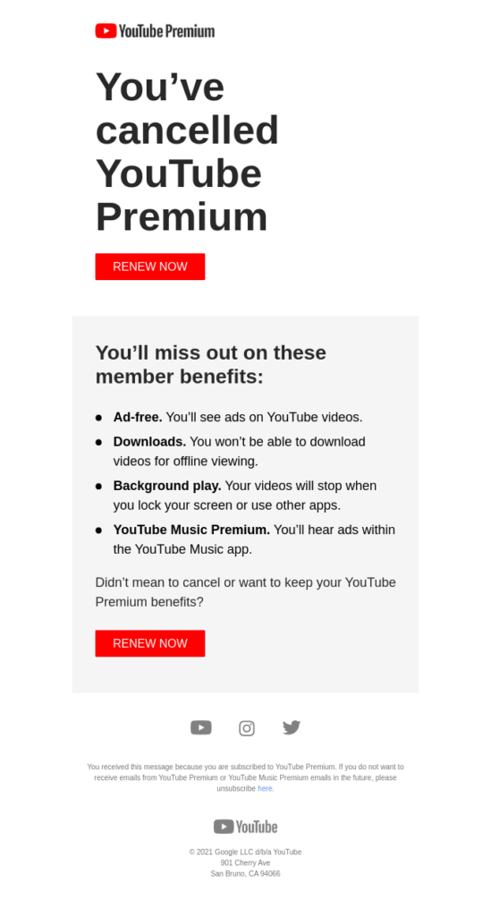
Besides being an excellent way to facilitate readability, bulleted lists perfectly match different needs. They communicate the agenda appointments of an event; set out the content of a document or an e-book; describe the phases of a process (e.g. the activation of a service purchased by the user); define the elements of a checklist; detail the advantages of an offer, and so on.
Here are some suggestions:
4. Give your text blocks a breather—play with line and letter spacing
A further hindrance to reading content is the lack of space between lines and characters. The text block needs to breathe. For sure, we won’t get an outcome like this:
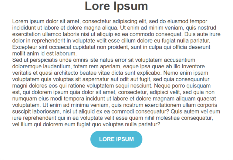
The BEE editor provides you with a number of features and solutions to avoid this risk:
- manage the leading of the different blocks of text to increase the line spacing
- increase the size of the text, which is usually preset at 12 pt. In this case, the line spacing will automatically adapt to the change while keeping the same font size
- play with letter spacing to increase the gap between the characters of a heading or any word in the text
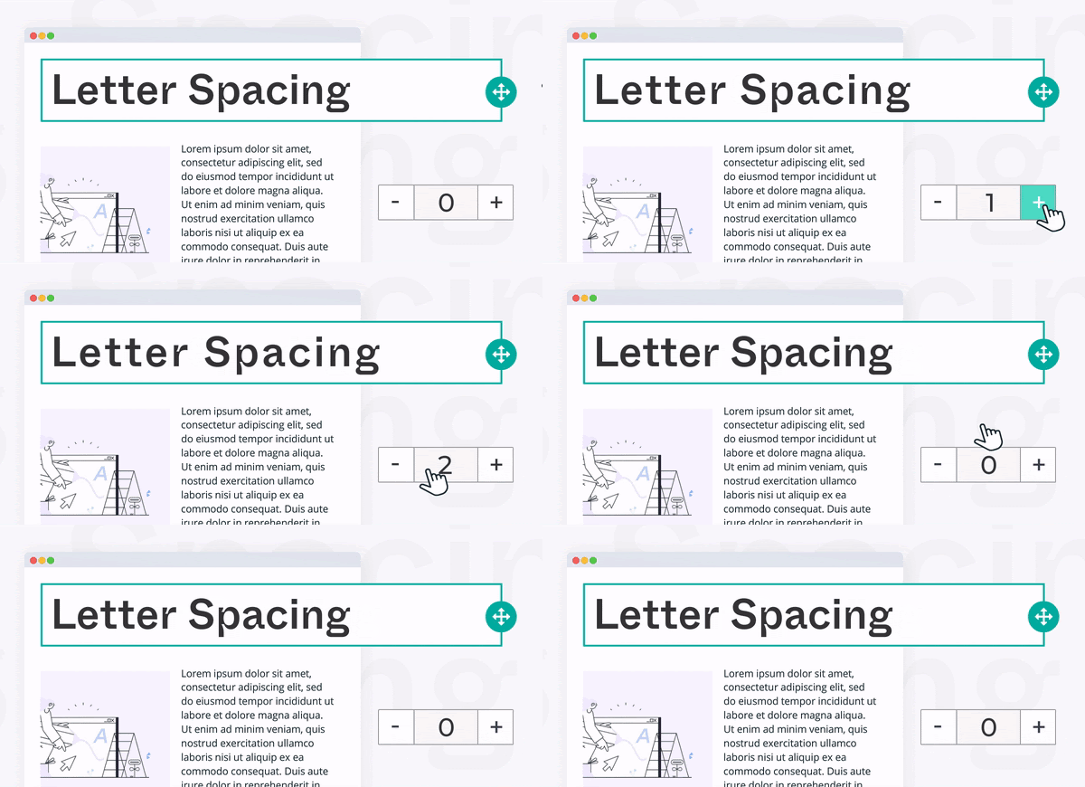
- adjust the padding of the modules that make up the message. This means setting the frame space of each block to increase, for example, the lower and upper margin between the heading and the paragraph
5. Break up text uniformity
The last (but not the least) rule concerns the formatting of characters.
You’ve broken down the text into paragraphs, inserted (where possible) your bulleted lists, and ensured the right space between letters, headings, and message forms. Now’s the time to break up text uniformity and highlight the keywords by inserting bold types, color for emphasis, and hyperlinks.
Use bold type to guide the user’s gaze to the keywords you want to emphasize, and give a different color to links to stress their presence.
For example, look how these simple measures make the following text more readable:
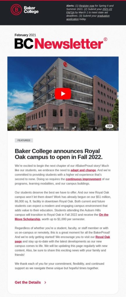
Especially when working on a long text, highlighting the main concepts is a mandatory step. The BEE editor makes it even easier as it lets you:
- copy your formatted working document texts in the message or page editor when ready—this without losing bold or italics formatting
- format directly in the editor, as the practical toolbar provides you with all the tools you need in one place—maneuver, expand, and collapse it as you wish, so as not to hamper your visualization.
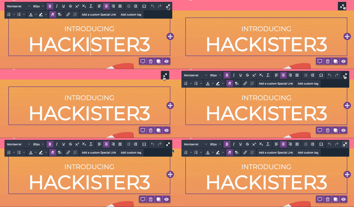
In any case, we suggest not overdoing the text length. Studies show that the more words within a page, the higher the complexity of learning, and the lower the number of concepts the user can assimilate.
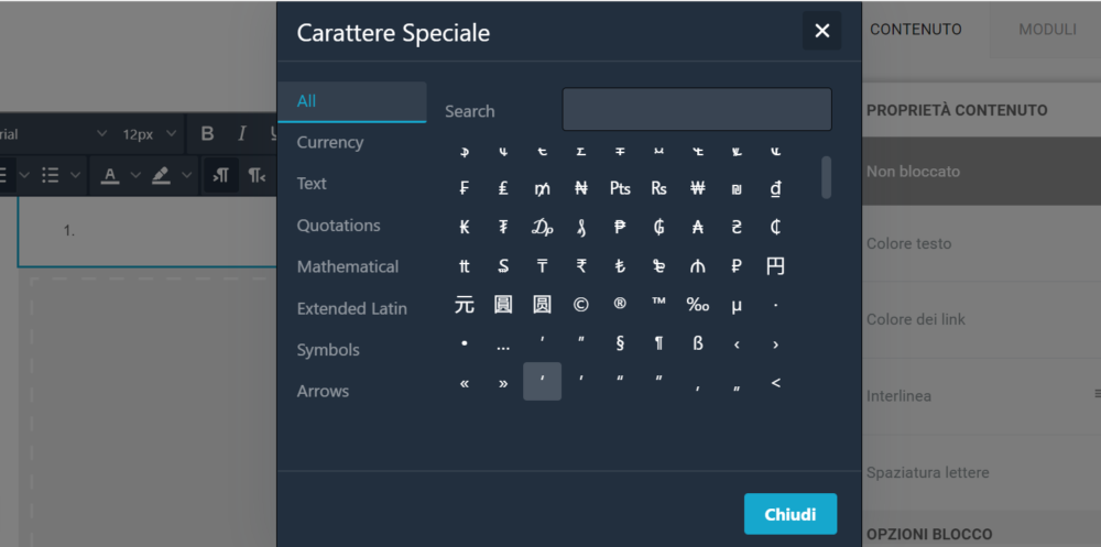
Summarize your content with the same trick for optimizing the subject line’s length: use “speaking” symbols and special characters. The BEE editor sorts them by type for an easier search (no endless scrolling!).
In summary
The effectiveness of a good content marketing strategy isn’t just a matter of copywriting. It also depends on typography and text design.
An easy-to-read message or page is in fact a key starting point. If you miss it, even the brightest and most original content won’t be absorbed and picked up by your audience.
Now it’s up to you to start formatting your texts at best and put these simple rules into practice. Take advantage of all the intuitive features of the BEE editor and the MailUp platform.