Summer email designs: top 4 email campaigns
Summer email design: why we picked these 5
Here are the reasons why we liked these email campaigns above all others:
- Because they perfectly embody one of the strategic musts of email marketing – the need to be always on the same page with the expectations, tastes and moods of whoever is receiving the message.
- Because they think in terms of campaigns, and not of single messages: once established a layout and a template, they play with variations on the theme.
- Because they take advantage of animated GIFs, and bring a lot of creativity into play.
From developing integrations to strategic support, from creating creative concepts to optimizing results.
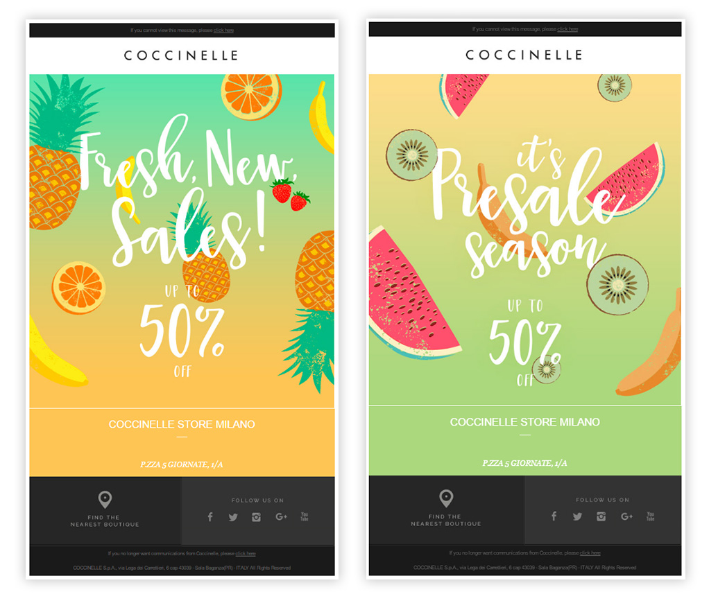
Coccinelle: cocktail inspiration
For its messages about the seasonal sales, fashion brand Coccinelle takes inspiration from the colours of summer cocktails, playing with illustrations that bring to mind exotic fruits and places. By inserting the text in the graphic itself, the brand can afford to use an original and high-impact font (what are we talking about?).
The email template is as simple as it is effective. As the ancients said, repetita iuvant (repetition helps): the decision to keep the message uniform and vary it only in the details helps to reinforce the concepts and to provide the recipient with a message that’s familiar, expected, and more likely to have an impact. A strategy that can lead to better results in terms of click-through rate than messages that are too varied, random, and incapable of creating a pattern in the mind of the openers.
Zalando: popsicles and pop colours
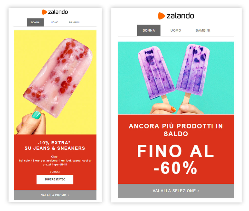
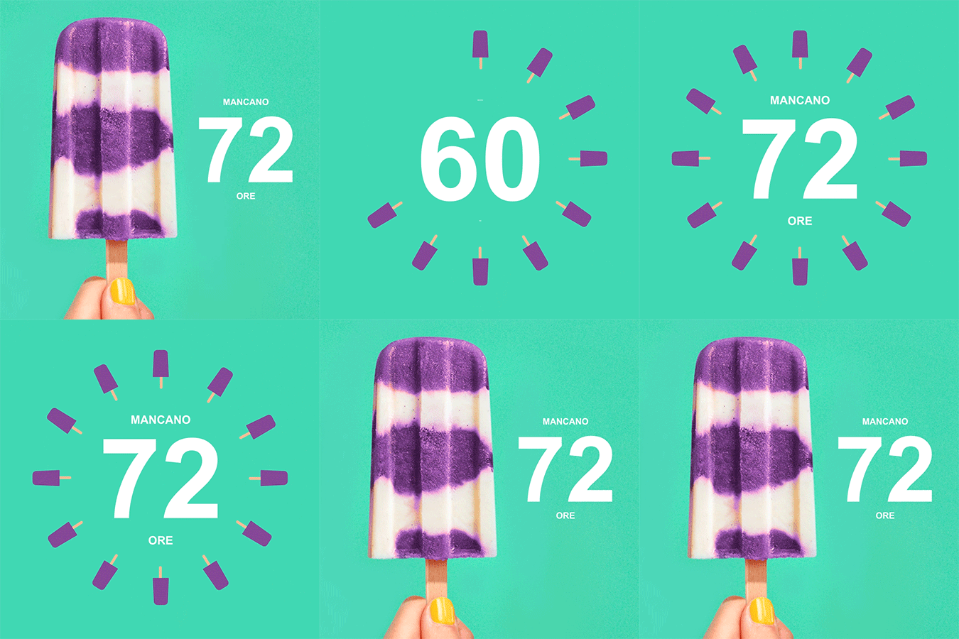
The summer campaign of online clothing giant Zalando also revolves around a lively theme that immediately brings to mind summer: popsicles.
Their e-commerce campaign uses images that strike a chord with everyone, which manage to condense everything they seek to evoke into just a few elements: childhood memories, summers at the beach, flavours that we all know and associate with the seaside in August. The images are simple, the theme is recurrent – what changes are the details and the colours – pop, fresh, capable of grabbing people’s attention and making their mouths water.
The sales reminder email is enhanced by the use of an animated GIF (also popsicle-themed, of course) complete with a countdown timer, which promises even better performance thanks to its greater visual impact:
Athleta: power to photography
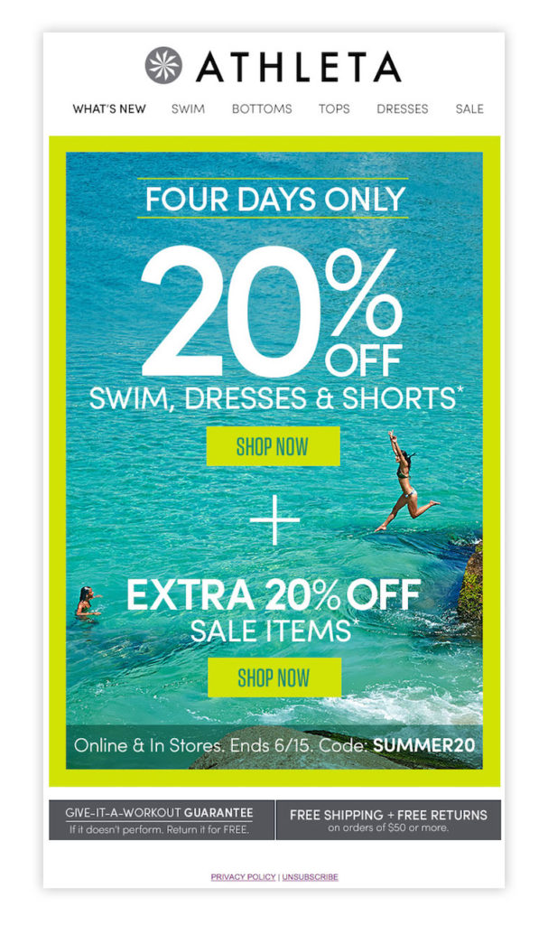
In summer, Athleta is in its element – selling swimsuits during holidays can be approached in a thousand and one ways. The chosen template is simple: the copy does all the work, along with one, catchy image – colourful, evocative, an exceptional click bait.
Shopbob: focus on colour
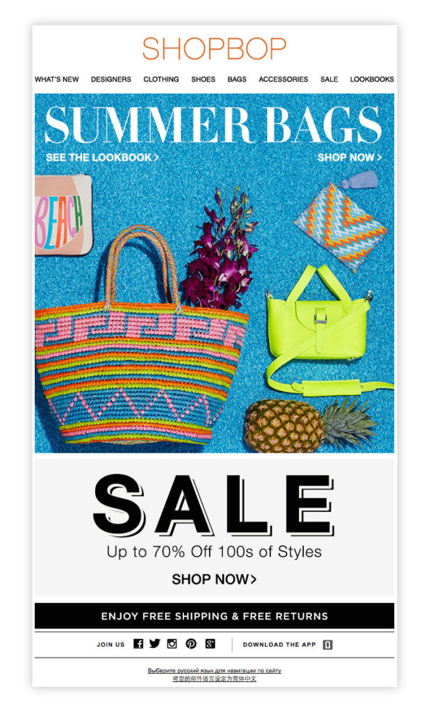
Shopbob‘s strategy is to focus on colour. What makes the difference are a summery main copy and the bright colour used for the hero image, bringing to mind a warm, maritime atmosphere.
Wrap up
It is always important to remember, when composing emails, that an extra sprinkle of creativity often makes the difference. For your messages to hit their target, you should put yourself in the shoes of those receiving them, and ask yourself: is it in line with what they are living, dreaming, experiencing? Does it strike an emotional chord that encourages them to click? If the answer is yes, you’re on the right track!