Data-informed design: a definition, its benefits, and some practical applications to design valuable user experiences

In the first part focused on human-centered design we explained the meaning of the first guiding principle of this approach, i.e., empathy and how it translates into practice.
Now we need to analyze the second part of the expression empathy-driven and data-informed, that is, data. What kind of data are involved in human-centered design?
These data aren’t business KPIs. KPIs, in fact, are corporate objectives we contribute to achieve in close and continuous collaboration with the members of other teams. Specific qualitative and quantitative data are the first metrics that we, as designers, observe. We’re also confident that our work can change them.
This article will dive in to make you better understand what data we consider, and how we collect them.

From developing integrations to strategic support, from creating creative concepts to optimizing results.
Qualitative data in MailUp
Before defining what a qualitative datum is for our team, let’s start with an example.
Consider this milkshake in the picture.

If you asked someone to describe it, what would he or she say?
“The milkshake has a double composition of vanilla and chocolate. It’s topped with sprinkles and a candied cherry, and it’s served in a refined glass. In general, it has a classic but well-finished look. Although very nice, it doesn’t appeal to me so much because of its somewhat aseptic context. In any case, I’d never drink it unless it were lactose free.”
To obtain qualitative data, we must collect observations on our focus domain (the MailUp product or service) through in-depth analyses made with our users and/or on the products in question.
At MailUp, we collect qualitative data through the following activities:
- Qualitative usability tests (8–15 participants)
- Semi-structured interviews (around 6 participants)
- Qualitative surveys (minimum 40 participants)
- Focus groups or co-design sessions (about 10 participants)
The results help us answer the typical strategic questions: Why’s this happening? How should we fix it?
Essentially, qualitative research helps us understand the current issues affecting the experience, and how to improve it.
Quantitative data
Let’s go back to our milkshake in the picture: we can also use measurements to describe it.
Its size is 200 ml, its temperature is 5 °C., and it costs €7.
The figures we used to describe the subject of our survey are individual, quantitative data. Each represents a measure made up of a number (200, 5, and 7) and a unit (ml, °C, and €).
To obtain quantitative data, we then must collect the design metrics, i.e., the numerical data.
At MailUp, we collect quantitative data during design projects through the following activities:
- Quantitative usability tests (30–40 participants)
- Analytics (Google, Pendo, Hotjar…)
- A/B test
- Tree tests
- Quantitative surveys (starting from 100 participants, depending on statistical significance)
The results help us answer questions like: How many? How much? When?
Given these premises, we could then define a design metric as follows: a numerical datum that tells us about some aspects of MailUp users’ experience with one of our digital touchpoints, products, or services.
What are the qualitative data we consider?
When conducting quantitative research in the design team, we focus on collecting metrics like:
- How long does it take to complete a task or process?
- How much effort does it take to use a feature or service?
- How difficult does a task or process appear to users?
- How many users can successfully complete a task or process?
- How satisfied are users with a product, service, activity, or process?
- How often do users return to use a feature, product, or service?
- How many people actively use a product or service?
- What percentage of users move to the next stage of a key task or process?
Direct metrics like task time, success rate, satisfaction or ease of use rating, and ongoing questionnaire scores are the heartbeat of the interactions we design. On the other hand, more complex metrics such as the number of conversions, the conversion rate, the number of return users, or the bounce rate give us invaluable insights into the behavior and attitudes of our users toward our digital products.
How to collect data: the three musketeers of quantitative design research
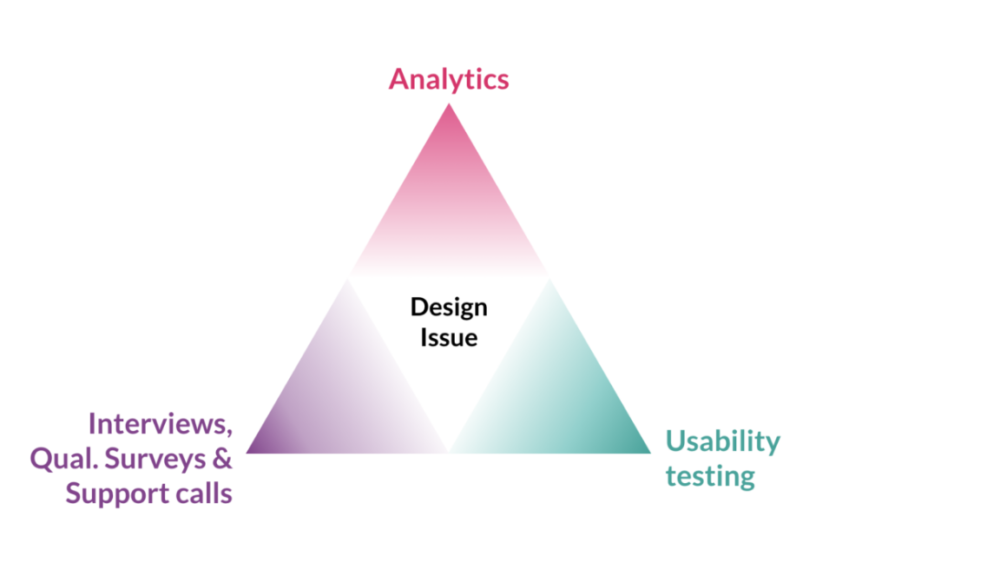
MailUp teams preferably use, depending on contexts and objectives, three different methods to collect quantitative data: Analytics, Quantitative User Tests, and Surveys.
How do we decide one from the other? We usually try to understand what’s realistic for the business program, for the team’s capacity, and for our skills—but also for the tools and the budget available at that time.
Usually, the choice isn’t directed toward just a single method. Rather, we almost always try to triangulate and use multiple methodologies to collect data on the same phenomenon because we know that all methods have their limitations and “blind spots”.
Analytics tools like Google, Pendo, and Hotjar allow us to observe user behaviors “in the wild”. However, Analytics data often lack context: they can’t tell us why someone clicked that part of the interface and what they expected to happen.
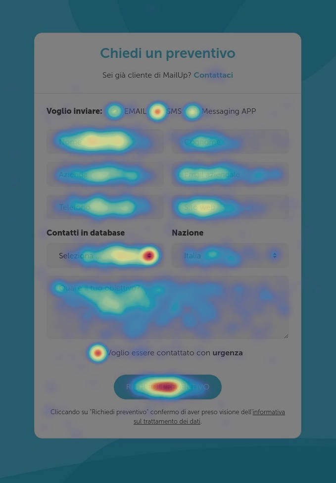
Example of a heatmap of a MailUp website page
Surveys, even the most “quick and dirty” ones through Hotjar, Pendo, or Typeform, allow asking users what their goals are and what they think—right when they’re browsing or in more in-depth studies. Obviously, obtaining statistically significant data and designing totally perfect questionnaires is a considerable commitment.
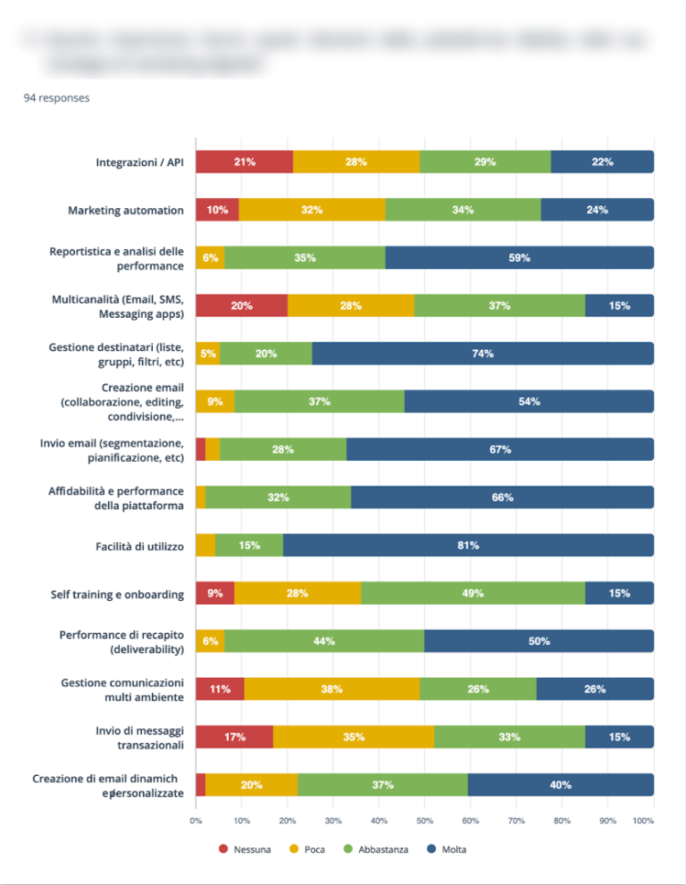
Example of a MailUp survey
Finally, quantitative usability tests through user testing allow us to analyze user behaviors and opinions by recording their interactions with the system as they perform assigned tasks. The analysis benefits from the fact that the context is fully controlled. But even this requires a researcher’s time to plan and conduct a study.

In summary, quantitative research helps us understand the extent of design problems (how serious the issue is or how many people it affects). It lets us consciously prioritize the problems we aim to solve. It supports us in experimenting with solutions and, last but not least, it helps teams in supporting their work and showcasing the value of design.
The ROI of design
This last point is very important: one of the marks of design coming of age within a company is the business itself understanding its strategic value.
Getting company managers from considering design as an on-demand “production of deliverables” to an “asset to move KPIs” isn’t an easy task. MailUp designers had to learn to speak the language of their interlocutors, empathize with them, and follow their mental model to show them the potential of the human-centered approach.
We saw this as soon as we started collecting the first design metrics: they are numerical representations of an improvement in a digital product that is sometimes impressive.
And when —with the help of our Marketing, CVM, and Product colleagues— we linked those numbers to business KPIs (such as revenue or cost savings), the focus started to shift from designing something a certain way “because of a desire or an opinion” to designing it to affect profits.
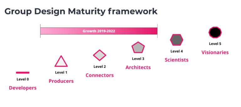
There’s still a lot to do. Changing a culture isn’t easy. However, we know we’re on the right track: our will, together with the Group to which we belong, is to bring the maturity of internal design to compete with those of the best international companies.
As we’ve told you, we have the heart and the head to do it: we’re empathy-driven and data-informed.
