Halloween Email Campaigns: 6 Design Tricks and Treats
But, should everyone send Halloween email campaigns? Yes! If you’re not sure what to send or you’re still putting finishing touches on your campaign, consider these six tricks and tips to put your Halloween email design above the rest. We’ve rounded up some spook-tacular examples from real brands to help you get inspired!
From developing integrations to strategic support, from creating creative concepts to optimizing results.
1. Create a clever product arrangement
We love when things are arranged neatly. Fortunately, drag-and-drop email design editors (like BEE editor) make it easy. Here’s a great example—from lighting and furniture company ATG—of how a well-structured layout can allow you to feature a lot of products without creating clutter:
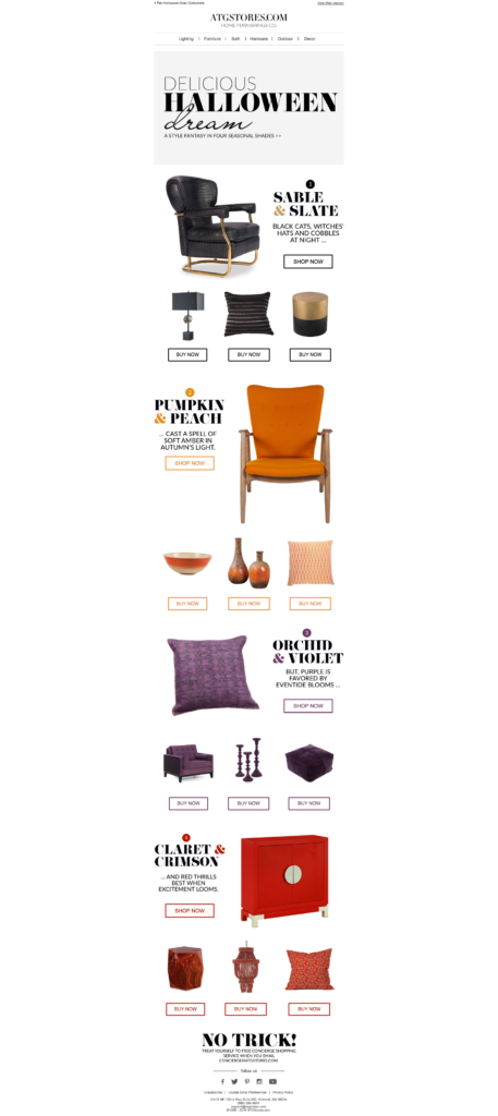
All items are organized by color (which readers have been primed for with this subject line: “These 4 colors ARE Halloween.”). Playing with a color scheme is a smart and simple way to build a holiday email without feeling like you’re straying too much from your brand identity. If it’s not your thing to drape your email in spider webs, ATG shows you how to take a subtler approach.
To display a lot of products without clutter, ATG is careful to simplify its design with these tactics:
- Using the same layout and same number of products (4) for each module
- Being consistent with the shapes of the items and size of the images
- Deciding products aren’t accompanied by extraneous text (like name, price, or description)
- Making sure CTA buttons are all the same size and style
- Having consistent padding between items
With clean design, ATG is able to pull off its clever product arrangement and get in the Halloween spirit.
2. Keep it simple
Some of the most effective Halloween email campaigns we see are the simplest ones. That’s because emails aren’t websites—they should only contain enough content to get your audience intrigued and interested to click for more. This Halloween message from Grammarly is a perfect example of great simple design:
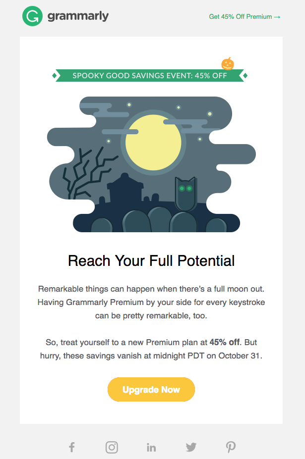
The email is effective because you can read and understand it in a matter of seconds. There’s just one of everything: hero image, header, section of body text, and main CTA. Often, that’s all an email needs!
Grammarly, a proofreading tool, also doesn’t have an obvious tie to the holiday. Like ATG, Grammarly isn’t selling Halloween decor, candy, or witch costumes. Yet Grammarly celebrates the holiday with a sale by using thoughtful illustration and playful copy—which is hopefully enough to draw in readers.
3. Use eye-catching images
The visual elements in your email can make or break how well it performs. This means that instead of including the same standard product images again and again, getting creative will keep your readers’ attention. In its Halloween email, Paperless Post shows us how clever prop staging and out-of-the-box thinking can make a digital product (an e-invitation) a lot more exciting to look at in your inbox.

Like Grammarly and ATG, the Paperless Post email is spare on text. In fact, there’s pretty much just a header, a line of copy, and a call-to-action. As long as you have a distinctive image, that’s all you may need.
Whichever method you use, remember these image-in-email best practices for your Halloween email campaigns:
- Never make your whole email one huge image
- Your CTA buttons should be bulletproof, not images
- Always add ALT text (the small text that appears when you hover over an image)
4. Establish a clear hierarchy
The first image in your email might be all that readers see, so grab their interest with it. In this spooky email from Food52, the hero image is actually an animated GIF.

Here’s the full email:

We love the spooky nature of the GIF and how the dark colors are repeated throughout the email for a monochromatic look. As the most important piece of content, it makes sense that the GIF appears at the top. In fact, when it comes to establishing hierarchy, a large image that stretches the width of the email is the strongest option—it tells readers what’s most important. After that, secondary content is often divided into multiple columns, just like Food52 does with its “Paint it Black” section. The email hierarchy allows readers to see the most valuable information first and it makes the full message quick to scan, too.
5. Clear the clutter
At first glance, this Halloween email from Tattly, the fake tattoo company, looks super bright, modern, and simple. Why? It’s a matter of white space.

Pumpkins tend to evoke a sort of traditional, country vibe. To avoid that, Tattly not only shows tattooed pumpkins, but it also leverages white space in its Halloween email, which takes the aesthetic from traditional to sleek. Doing this reinforces how powerful white space is, and how smart planning can help that space showcase well-lit and thoughtfully-executed photos, too. The result will yield an email that looks fresh and uncluttered.
6. Optimize your CTAs
Of the Halloween email campaigns seen so far, this festive email from The Honest Company gets a lot of things right.

The email employs a single column modular design, so readers can take in individual bite-sized pieces of content, one at a time. Each section follows an inverted pyramid layout: image, header, text, CTA. And the CTA buttons are just right—they contrast clearly against the white background, leverage the “isolation effect,” and use action verbs. The buttons also pass the squint test: if you step back and squint your eyes, the buttons can still be clearly identified. Like the remaining emails in this post, The Honest Company’s message is another great example of simple design, minimal text, effective layout, and—most importantly—clear calls-to-action.
Wrap Up: Tips for your Halloween email campaigns
Even if you aren’t offering pumpkin tattoos or recipes, you can still build a Halloween email campaign that converts. Spend a little time on distinctive design and well-curated content, and use these tips:
- Arrange and display products by holiday-relevant color.
- Keep it simple: having one festive hero image can go a long way.
- Break the monotony of your images with a creative photo shoot.
- Establish a clear hierarchy that puts the best content first (try an animated GIF!).
- Incorporate white space to make your email look fresh and modern—and easy to read.
- Use a holiday-relevant color for your call-to-action buttons, and optimize them.

