Email marketing and typography: tips on formatting and style
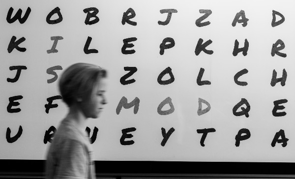
Much of the recent typography discussion in Email Marketing has focused on web fonts and fallback. Companies constantly seek better CSS support in email clients. This is meant to overcome the difficulties in displaying email characters among the recipients’ different inboxes.
Typography in Email Design comes in many ways:
- Typography can mean paying more attention to the display of standard text
- Certain glyphs and fonts can convey nuances in the message
- Typography, especially personalized fonts, helps design an impactful email design.

From developing integrations to strategic support, from creating creative concepts to optimizing results.
Some preliminary technical considerations
The various email clients share a CSS support to define the text formatting properties. The good news is that, for the most part, this is solid and reliable.
With some caveats, margin control (applied to tags <p>), text indentation (of the first block line), line spacing, and bold are generally consistent. This means that our challenge as email designers is their correct implementation.
However, reducing email typography to these text-formatting properties is an understatement. It means tackling just a small part of the topic.
Sure, we can control these variables. Yet the biggest design issue comes with certain environments. Both Microsoft Word and our browsers have made us unaware of the typographical sins that surround us. The worst? It’s the failure to properly align bulleted lists.
Here’s an example:
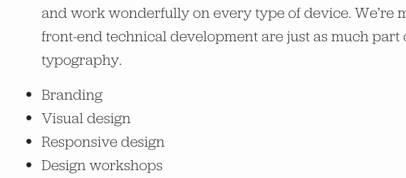
Instead, a bulleted list should have the following indentation:
- Branding
- Visual design
- Responsive design
- Design workshops.
As you’ll see, implementing bulleted lists in an email isn’t as easy as it looks.
How Outlook behaves
The easiest way to get left-aligned bulleted lists is to apply a negative margin to the elements <li>, like this:
li {margin-left: -20px; }
This way, everything looks reliable. However, only AOL Mail, Apple/iOS Mail, and the native Android mail client support the code. In most cases, the bullets align with the left edge, and the entered code has no effect.
The biggest problems with bulleted lists involve Outlook 2000+ where bullets are truncated, regardless of the margin used. All bullets entered with a negative margin will be truncated.
This is to show that, although line spacing and other formatting aspects can be adjusted, even a bulleted list often remains well beyond the control of expert email designers.
From the technical side of things, let’s now move on to the more creative aspects of typography. Here are some great examples of using text and formatting to create impactful emails.
Use of typography to create impactful emails
Typography is one of the most popular tools for email designers. It’s not just an occasional technique. Rather, it’s meant for creating interesting and creative projects where the typeface turns into the message’s central element.
Let’s take a look at this gallery of examples: each campaign uses and takes advantage of the typography in a particular way. Each gives its own representation of the brand, strengthens the message, and stands out from other communications in the recipient’s inbox.
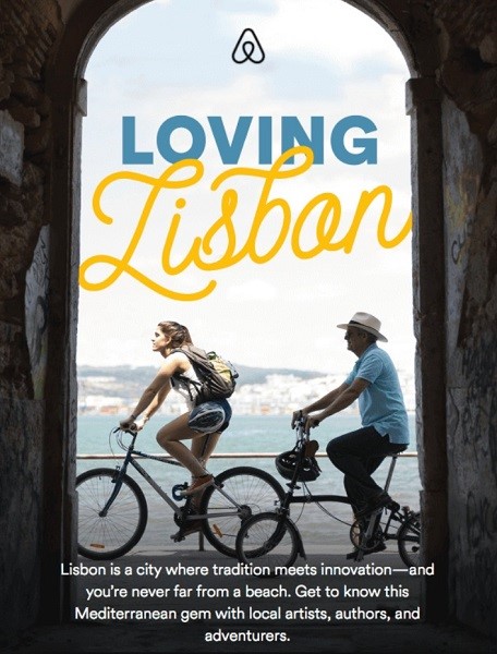
In the Airbnb email, we note that there are three different fonts: both the destination name and its defining adjective display a distinctive font.
Note the destination. A broad, cursive, and fluid font unfolds flexibly. This refers to the idea of luxury, fantasy, and romance: all terms that Airbnb combines and associates with Lisbon.
The font stands out even more from the combination with the “Loving” font, which has a simpler style of very standard block letters. Finally, the description at the bottom of the image further contrasts with the main font of “Lisbon.”
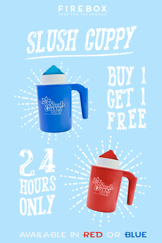
This email is a classic yet intelligent example of how to use a font to sell a product. The font highlights the promotion without shouting, which also comes from the discrete use of colors.
Its large, curved design immediately attracts the recipient’s attention, giving the email a style that calls to mind billboards, large posters, or a storefront. The sinuous feature, with its white color and spotted appearance, is reminiscent of an iced drink, just waiting to be enjoyed on a hot summer day.
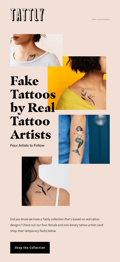
Tattly’s font is more rigorous and clean. Subtly, it goes with tattoo images for a simple yet impactful look.
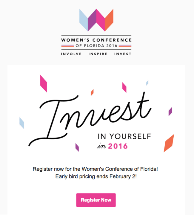
We conclude our list with an email that creatively uses typography to evoke a different mood from the meaning of the written word. The subject of the email is clearly identifiable: investment.
The idea of investment usually evokes a certain imagery of business, risk, cost, and expense. Now, this Women’s Conference email picks a font that makes the word and the concept elegant and creative since it’s associated with a just cause.
Furthermore, the contrast between the “Invest” font and the others used in the email further accentuates the main message. This isn’t just a smart choice to highlight the central topic of the email and the promoted event. It also evokes a certain mood to trigger a boost of clicks on the call to action.
In summary
Email design is always seeking a compromise between the personal experimentation of each brand and the ability to capitalize on the most popular trends.
The BEE editor offers the most advanced email creation tool on the market. If you haven’t yet, request a free MailUp platform trial where BEE and all its features are integrated and available.