Email Design: 4 Tips for Header Design
The header is the first thing a recipient sees in an email, it’s the curtain that rises on the communication. Whether bold or sober, the header is how a company presents itself to the public, transmitting its visual identity.
In this post we’ll delve further into the matter, analyzing what an email header actually is and some examples of how to design it to have the best impact with your recipients.
What is the email header?
In email marketing, the header includes the subject, the recipient, and the sender, as well as the HTML header in the body of the email. In this post we’ll focus only on the latter, that is, the part of the message that you see upon opening the email.
The header basically includes the brand name, logo or both. This is the basic framework, to which you can add a menu of products that links to your site, or copy (payoff or text related to particular advantages, discounts, or services such as free shipping).
The header may not seem important, but in reality it’s the perfect place to fine-tune some key marketing strategies. Consider it the space where you can insert marketing or business information. As mentioned, you can also simplify browsing an email by adding a menu to the header.
Well-designed headers have certain key qualities. Here are three basic best practices:
- Make sure the header identifies your brand. The header reinforces what’s been communicated in the “from” field (the sender), so that the reader has zero doubts about who sent the email
- Make sure the header is versatile: a good header works with all types of campaigns, lending itself to all kinds of templates
- Create an elegant and simple header. Don’t cram tons of information and elements into the header. Make it clean and useful, like a business card. Here’s a great example from Clarks:

Header design
When designing your header, remember to:
- Not overdo the browsing menu, which must remain concise, clear and useful
- Don’t make it too big. Try to make the header less than 70px tall if it doesn’t have a menu or less than 200px if it does
- Don’t wander off topic. The header must have consistent graphics, fonts and colors. It’s not the place to experiment with new original ideas.
4 tips for header design
1. Best practice: always insert your logo
Using your company logo lets you easily check off all three to do items listed above: a logo is iconic, simple and versatile.
If you include a browsing menu in the header – which is especially important for e-commerce companies – reduce the header size and optimize it by putting your brand name or logo at the top. Here’s how Uniqlo does it very effectively:
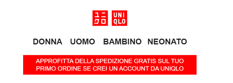
Using your logo as a header is the easiest way to put your brand on the communication and bring recipients immediately to the heart of the email.
2. Color is always a good idea
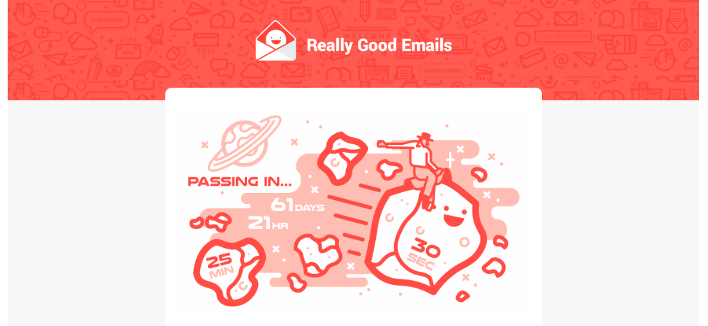
Another simple and versatile way to create a header is to use color. Nothing complex, artistic or experimental. Simply use the color of your brand. Here’s a very basic example from Really Good Emails, which opts for the coral color of its visual identity; simple but very effective.
Mashable instead opts for a more refined solution, choosing a bold blue that helps strengthen its visual identity without losing anything in terms of cleanliness and clarity.
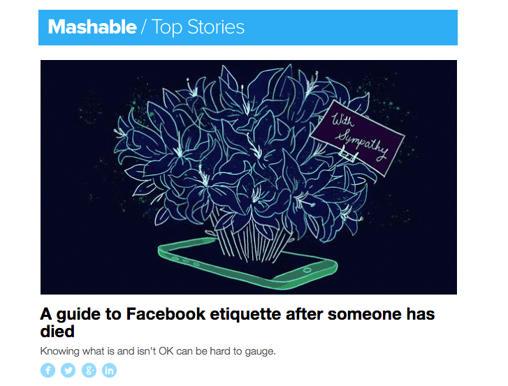
To use a bold color like the one above, you can use an HTML background color.
How do you use background color in emails?
- Coordinate the background color of product photos with the HTML background color of an adjacent plain text section to improve your image-to-text ratio. The email will appear lively and creative, but won’t get caught in spam filters and won’t be bogged down with large, slow-to-load images.
- Use a single background color for your entire email by choosing a light shade and making sure your text color contrasts and is easily read.
- Break up long emails with color blocking. Use bright background colors in different modules to improve organization and call attention to various sections.
3. Grab attention with photos
Including an image at the beginning of your email is always a great way to catch readers’ eyes. A photo header is no exception.
Munchery’s example is excellent, which uses a quality, high-impact photographic header:
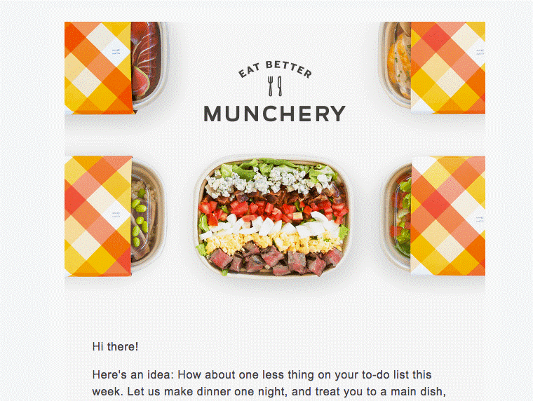
When choosing a photo for your header, it’s important to consider the versatility of the photo. If your email usually includes many images, consider whether the image you add to the template works well with the content you’ll send in the future.
4. Combine consistency and variety
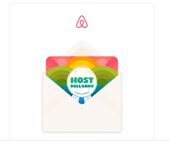
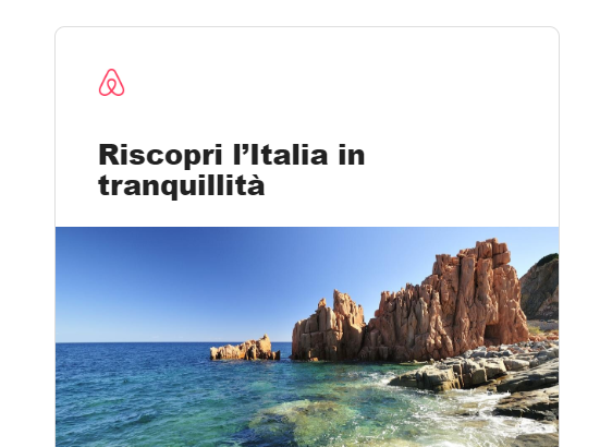
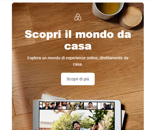
Keeping the header consistent doesn’t mean never ever changing it. If you have a different set of emails for different objectives, we suggest making slight changes to the header to make it visually interesting and add a touch of personalization.
Here’s how Airbnb makes small changes to its template and the position of the logo between one email and another, based on the goal of each campaign:
Unstyled by Refinery29 has a similar approach. The text in the email header never changes size or positioning, but each email has a different color scheme, creating a beautiful rainbow effect.


If you choose to instead customize your header, it still doesn’t hurt to have some fixed versions: so-called templates. While the Unstyled newsletter always has a personalized header for each email, Chubbies rotates between at least three different headers: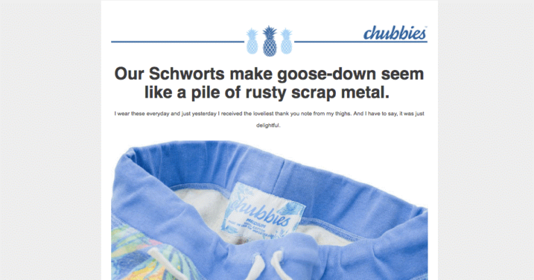
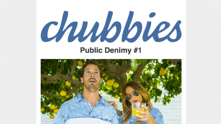
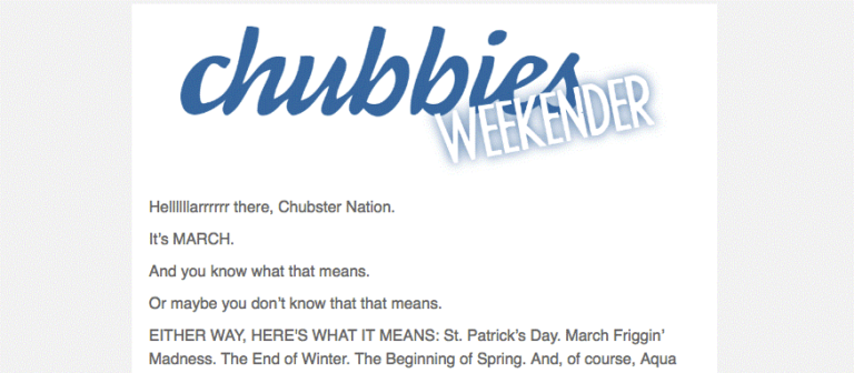
This allows making emails dynamic and interesting. And Chubbies does it without ever moving away from a coherent use of its logo and color, always making its brand identity clear and consistent.
In summary
Email design is always seeking a compromise between the personal experimentation of each brand and the ability to take advantage of the most popular current trends.
With the BEE editor, you have the most advanced email creation tool available on the market. If you haven’t tried it yet, you can request a free trial of the MailUp platform, where BEE and all its features are integrated.