4 Fatal Mistakes In Managing Email Images

Today we will look into some errors that you could stumble upon while managing your email images. Actually, it often happens that you focus all your attention on the graphic rendering of the image: hours of work by the artists or designers, followed by a single click to upload onto the Email Marketing platform.
Still, to achieve optimal performance, having aesthetically beautiful images with good resolution is not enough. There have to be at least two additional steps:
- A precise brief to the graphic department, so that in creating images for emails they have to take into account the specifications and requirements of the email channel
- Post-loading actions on the platform (such as the inclusion of alternative texts, which we will discuss shortly), to minimize the possibility of failure or incorrect image display

From developing integrations to strategic support, from creating creative concepts to optimizing results.
Let’s turn then to the 4 most common errors made in managing email images. The order is completely random.
1. Images are too heavy
Everyone likes delving into a pretty picture, especially if nicely defined. Still, we must always keep in mind the medium we are using. Suppose the email client does not block images in advance: we can then assume that typically, unless they are sent as an attachment along with the communication, the images are downloaded only upon email opening.
Once the email opens in the client or the browser, it starts a request to the server where you have the images stored to be downloaded and then displayed. Obviously this means that the connection bandwidth is occupied by the exchange client/server data.
Now, bandwidth is not infinite. You can definitely see how important it is that file weight does not prevent images from being easily downloaded and displayed.
On the mobile side, an image weighing 1 MB is downloaded in about 0.3 seconds. Just think of the time that you are normally willing to wait to open a web page: according to Kinsta, 74% of users abandon pages that don’t load within 5 seconds, while the data here below by Soasta show how conversion rate starts its downfall well before 2 seconds.
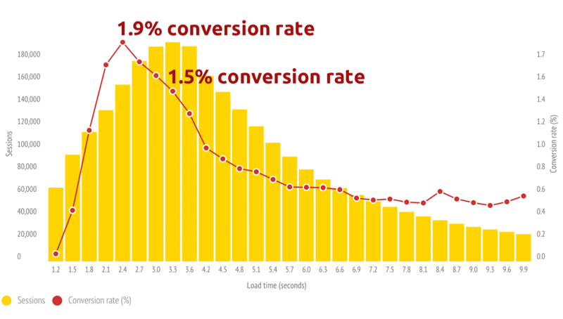
From these limited data it is clear how crucial it is not to unduly lengthen the loading time and processing images correctly so they are light enough to be quickly downloaded, at the same time protecting resolution to avoid the grainy effect.
Here are our recommendations to ensure the right balance between light weight and good resolution:
- Maintain a maximum weight of around 50 KB
- Make sure that the image resolution is 72 dpi
- Save images in JPG, GIF or PNG.
2. Images are too large or too small
It’s an all too tempting practice. If you have images or pictures taken for – say – an advertising campaign or your website, why shouldn’t you be using them for your email campaigns too?
Sure, go ahead. But remember that without the proper precautions, the size (height and width) of these images will not be optimal or functional to the message.
Let’s go into more detail. The HTML tag img allows you to define the height and width of an image. For example, the following line of code specifies that the image height will be 123 pixels and width 456 pixels.
<img src=”[ImagePath]” height=”123″ width=”456″>
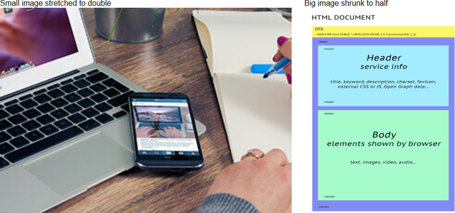
Once you’ve set one or both parameters, regardless of the actual size, the browser will show the image with the specified width and height. This means that if the image on the server has a smaller size than what is set in the tag, it will be enlarged, and if it is larger, it will be shrunk.
So, if you use an image with dimensions not optimized for email, two possible outcomes can results, either way with bad results:
- Image larger than necessary: greater weight and wasted bandwidth, with the setback in the case of section 1
- Image smaller than necessary: forced magnification, quality loss and grainy effect
Retina or regular screen?
A separate discussion deals with the Retina screens introduced by Apple in 2010. Retinal technology relies on a higher pixel density per unit area, whereby, according to Cupertino, the human eye would perceive the individual pixels. The image would then be more homogenous and viewing more enjoyable and less eye-tiring.
Since the density of pixels per Retina screen is approximately twice that as for a normal screen, to prevent a grainy effect you will need to double the size of the images. For example, if the image in the email has dimensions 250×145 px (i.e., <img height=”250″ width=”145″), you need to use an image of 500×290 px.
Our tips
- Cut the images to size for email
- Save all images in the same folder, so that you have the same source and more control when editing
- Don’t set the size of the images, keep them fluid inside the frame they are located in, allowing the communication structure to “shape” the image
3. Animated GIFs aren’t optimized
Adding an animation (like a GIF) to your communication definitely provides a lot of prominence to the message: this is an extremely effective way to attract attention, especially if the graphic design is created with care and is original.
Inserting animated GIFs into emails is easy, but you need to pay a little more attention than your typical static images.
Some history: GIFs, short for Graphics Interchange Format, were born in 1987. The basic idea was to define a default set of colors to be included along with the data that makes up the image so that, during compression, you avoid a loss of image quality.
Since 1989 the format received two important innovations: transparency, and above all multiple images that paved the way to animations.
Since then, designers around the world have sparked their imagination, creating historical GIFs that flood the web. To date, the health status of GIF is excellent: we’re thinking not just about how many ways they are included in emails every day but also the fortune of sites like giphy.com.
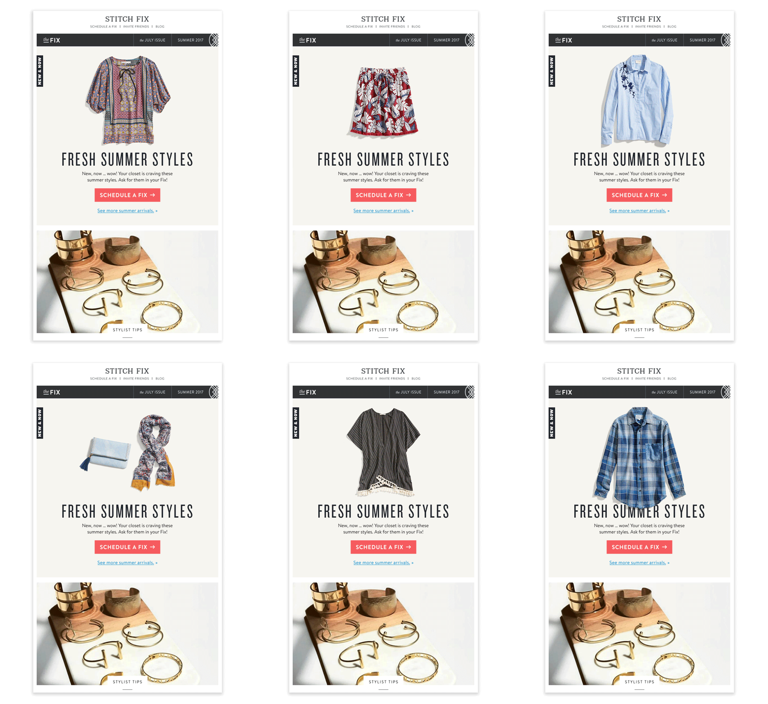
As in all things, in this case also, however, you have to pay attention to the media you are using. First of all, we have to consider that the weight of an animated GIF in KB rises rapidly as a function of both of the number of frames in the animation and based on the size. So, from the start it’s a good idea to think carefully about the type of animation you will be making.
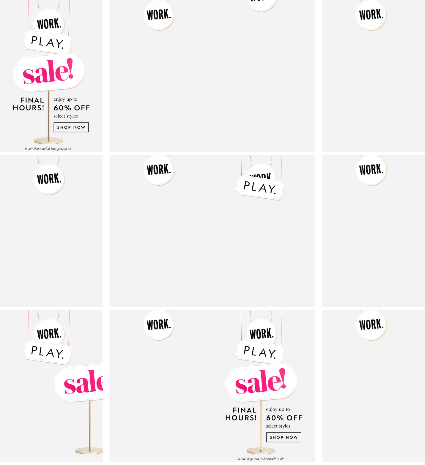
Secondly, you have to consider that some clients do not display animation at all. One of the main clients (Outlook 2007-2013) shows only the first frame – as the following example shows.
Our tips
- Pay attention to the total weight of the image (and remember what was said in section 1!)
- Don’t use more than one animation per email
- Don’t use too many frames: a GIF is not a video!
- Avoid overly complex animations that can compromise the entire assembly
- Make sure the first frame gives a full idea of the communication, in any case make sure that it is never empty
- Take advantage, for example, of the cinematography technique to reduce the overall weight of the animation
4. Alt Texts are lacking
Emails created without images are increasingly rare these days. However, bear in mind that some email clients, by default, do not display images, and for various reasons, some users prefer to disable them: in such cases, if the email does not have alternative ways to communicate the message, the communication is hopelessly compromised.
So let’s see how to effectively put a lid on this critical problem by leveraging the HTML, using the properties alt and title of the tag <img>.
Specifically:
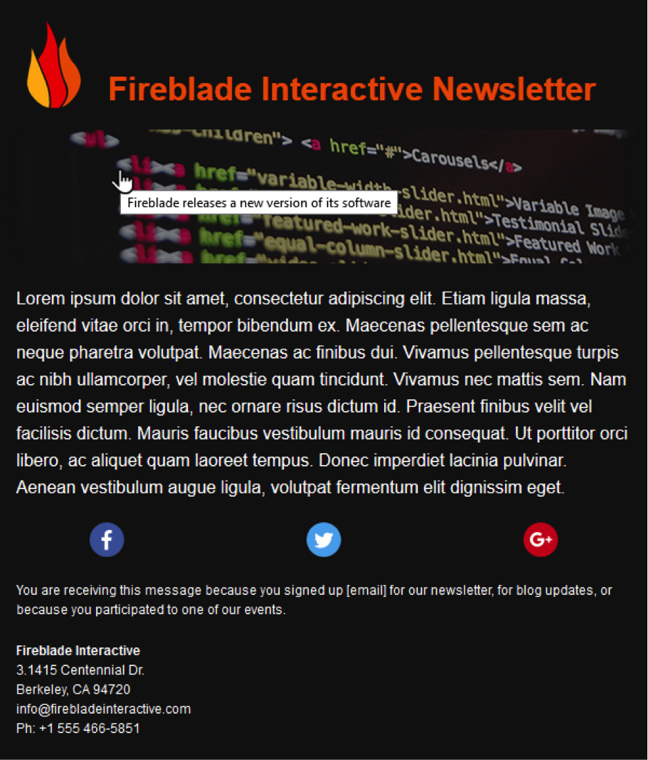
- title allows display of content when the mouse pointer is positioned over the area of the image
- alt defines the text to be displayed in the event of failing to load the image (Alt Text)
So it turns out to be very important to always add these two properties to the images that you consider strategic (like the brand logo, the visual, the product, etc.), giving them values with a description of what it contains the image.
Title attribute
Let’s see how the attribute title works: you can see from the figure that a little window appeared under the cursor with the text entered in code. So we can take advantage of this part to add additional information that would complement what is present in the image.
Alt attribute
Let’s go on now to analyze the behavior of the attribute alt, where there is surely more room for action.
The screenshot below shows you how the newsletter would display for an email client that excludes uploading images. You can see the classic blue and purple links that respectively show the presence of a link and a previously visited link.
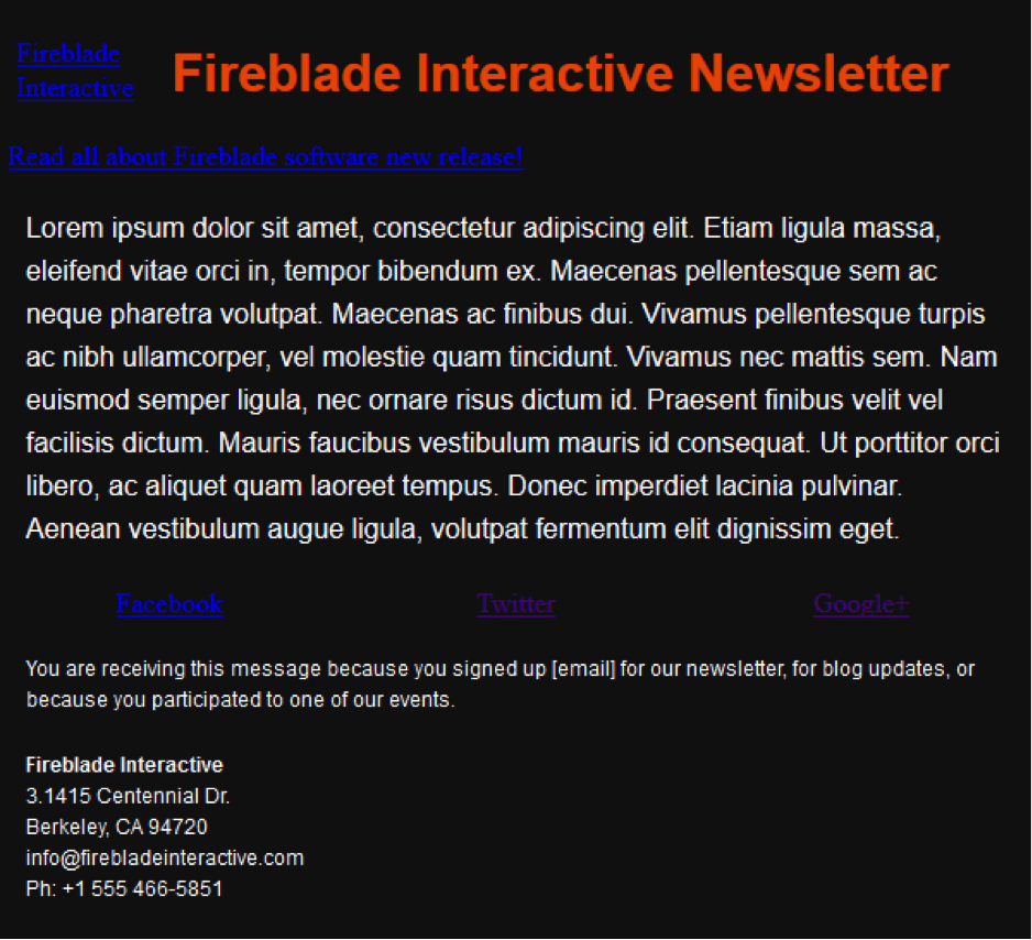
Obviously anyone who does email marketing does not settle for this much: ok, a text with a link appear when the image isn’t shown, but for sure this view is visually an eyesore, too difficult to read.
Can you improve this situation? Here comes CSS to the rescue. By applying inline style to the image as if it were a text, we can define not only the color (note the social media block), but also the size, the font and the underline.
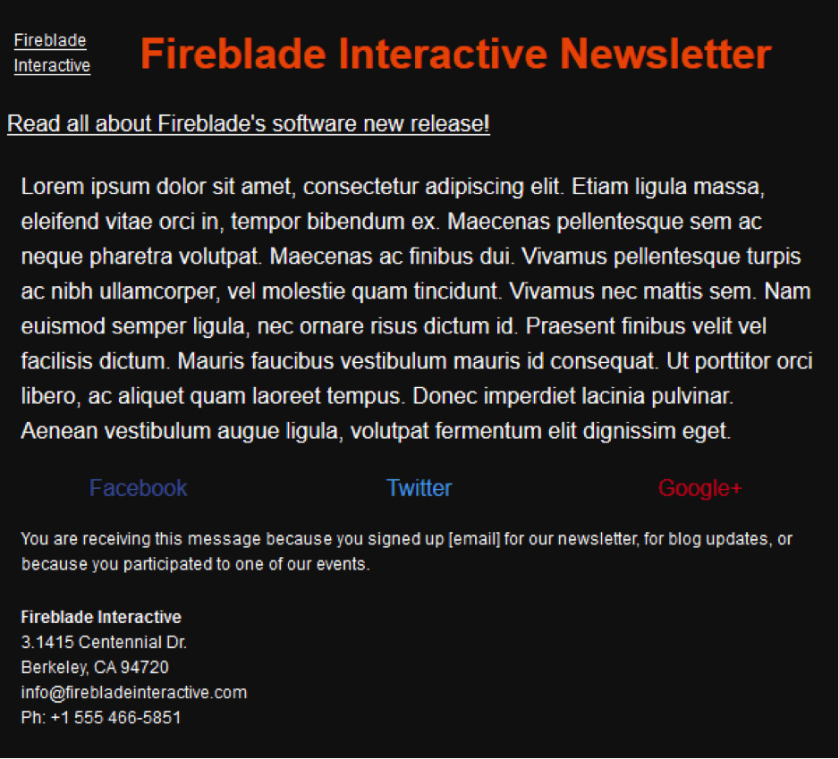
Let’s see the full code. Note that in addition to the attributes alt and title, the image has an inline style on it that defines the size (16px), the font type (Helvetica, Arial, …) and the text color (#ffffff) when the image is not loaded.

This way, even if the images won’t show properly, at least you won’t have a complete loss of information. Applying this technique we still get information through a nicely formatted text and in addition it highlights the existence of a clickable link to go to.
Our tips
- Make sure that the most important images have always values for alt and title attributes;
- Avoid exceeding the text entered, it might be too long and create several pages in the communication (for alt) or be difficult to use (for title);
- Make sure the alternate text color is easily readable both in terms of size and color, especially when you have a colored background;
- Preferably, leave the underlining to the alternate text with a link so that its function within the communication is easily recognizable.
What is your experience with images in email? Let us know in the comments section below!
