Mobile-friendly, responsive, and hybrid-design emails: here are the differences

Designing an email is never easy: in addition to a suitable template and graphics, you need to make sure the user experience is smooth and satisfying. There are many good ideas that you can put into practice at the UX design level, one of them being that your emails are perfectly readable from any device, especially mobile.
Let’s take a look at a few statistics to understand the size of the phenomenon: 75% of users say they read emails more often on their smartphones than on other devices; mobile clients represent 41.9% of emails opened during the first quarter of 2019 (source EmailMonday).
Mobile-friendly and responsive design are not the same thing
The various terms associated with mobile-optimized design often create confusion: should your emails be mobile-friendly or responsive? What are the differences? Let’s break down each term and find out what they mean and when to use them.


From developing integrations to strategic support, from creating creative concepts to optimizing results.
What does mobile-friendly email mean?
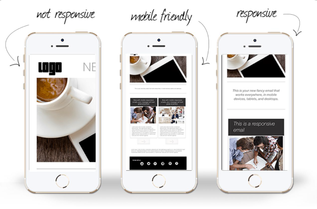
Mobile-friendly, also known as mobile-first, scalable, or mobile-aware, is a method that ensures perfectly readable emails on all devices by creating a scaled-down version of the desktop message.
These emails are based on a single column layout, with large text and a large call to action. These precautions ensure that the emails are legible even when they’re resized to fit the screen width of mobile devices.
The advantage of mobile-friendly emails is that they allow quickly obtaining a mobile-optimized design, as they require little code.
They are the simplest emails to create, but have some drawbacks:
- they have limited design options
- they are not technically optimized for mobile devices
- they only make emails designed for desktops readable by mobile, nothing more.
What is responsive design?
Responsive or “adaptive” emails adapt to the size of the screen the user is reading from.
A desktop email can be from 600 to over 800 pixels wide; if read on the small screens of a smartphone or tablet, they would force the user to continuously scroll left and right to see all the email’s content. This is exactly what happens in “not responsive” emails, models that are now almost completely outdated, fortunately.
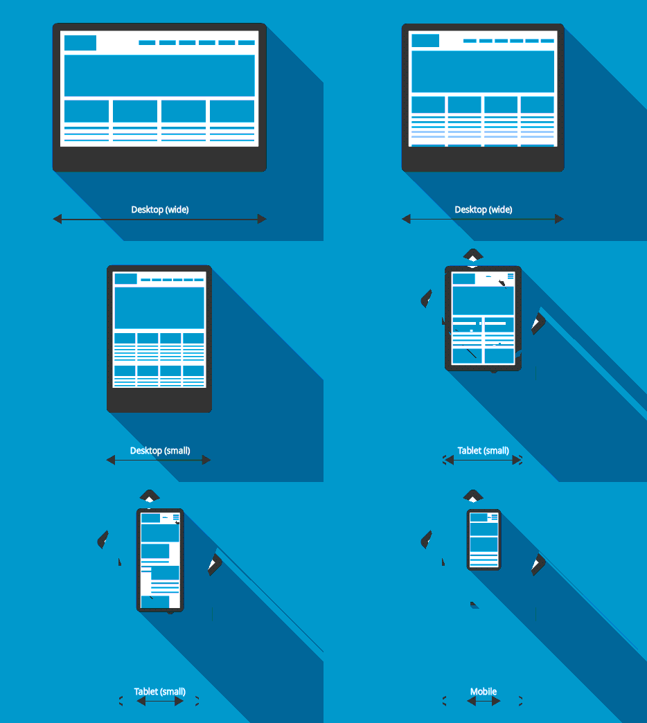
In responsive emails, the content is instead automatically resized to facilitate its reading on smaller screens (on mobile the width is 320px vertically and 480px horizontally). In practice, with an adaptive design:
- you move from a multi-column structure to a single column one, with various elements stacked one below the other, instead of side by side as in the desktop view
- images shrink
- texts increase in size
- the calls to action are resized to be large, clearly visible, and easily clickable with a thumb, which is the most common mode of interaction with smartphones.
Mobile responsive emails do not have a fixed structure, rather a modular one which allows the whole structure to adapt to the available space in width. This “elasticity” of responsive design depends on the use of CSS media queries, which modify the email according to specific rules, or sets of styles, which are applied according to the detected screen.

Historically, one of the biggest drawbacks of responsive emails was that Gmail didn’t support this method, but a Gmail update of late 2016 remedied the issue.
The advantages of responsive emails are:
- readability on any device
- improved user experience
- in mobile view some elements can be hidden if you set it up from your editor
- there is a vast number of responsive email templates available.
Thanks to this small extra effort for the subscribers of your newsletters, you increase the chances of interaction, encourage their loyalty to your news bulletin, and improve brand awareness.
The cons of responsive design include:
- the development process takes longer than other solutions
- it is not supported on all devices.
What are hybrid-design emails?
Hybrid email lets you adjust emails based on the width of the device from which they are read. The main difference from the responsive method is that it doesn’t rely on specific media queries or breakpoints to change the email layout. Hybrid emails work universally on any client, using a combination of percentage-based widths, maximum widths, and smart workarounds for Outlook clients.
The only downside to this development style is that the process becomes complicated, with complex layouts.
Mobile email templates: which method should you use?
As we have just seen, there are pros and cons to each solution. The choice should depend on your development resources, your contact database, and their needs. However, keep in mind that responsive design is the most effective and complete model, which guarantees the display of your emails will always be perfect from any device.
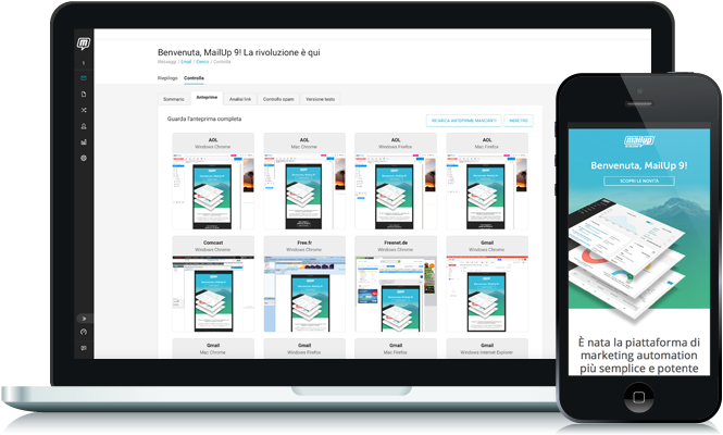
Analyze your database: what devices do most people use to read your emails? Act based on this data and then use tools that let you preview your emails. For example, with MailUp’s BEE editor you can check the performance of your emails in real time before sending them to your contacts.

Whatever your choice, always keep in mind that mobile email accounts for 26 to 78% of opened emails, depending on the target audience, product, and type of email you send (data: emailMonday).
One last important point: to give emails a responsive design, you don’t need to know HTML or know how to design. Just rely on an editor that allows you to create emails with a modular design, automatically optimized for mobile.