7 Fresh Design Ideas for Your New Year’s Email Marketing

Idea #1: Offer a $20.17 or 20.17% discount
Last year, we caught a few emails in our inbox offering a 2016-themed discount for $20.16 or 20.16% off a purchase. This is a cute and clever approach that many brands aren’t using yet. Lord & Taylor, for example, was the first to send a two-email campaign that started with the subject line, “Special Email Exclusive Offer Only for You — Happy New Year!”.
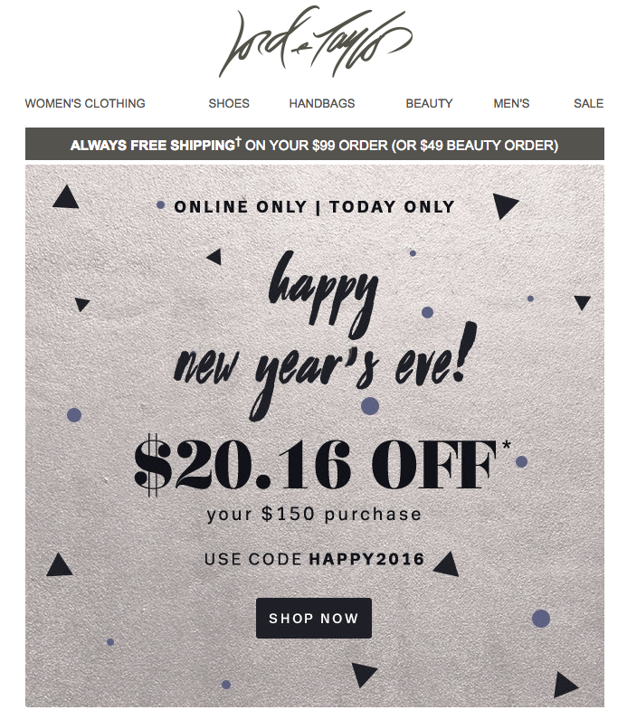
The day-long promotion occurred on New Year’s Eve and ended at midnight. The first email was sent around lunchtime, followed by another one sent around dinnertime, with this GIF:
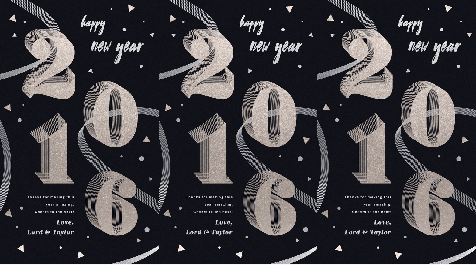
We love how the retailer put a personal touch on the second email by sending a happy 2016 wish, thanking readers, and signing off with “Love, Lord & Taylor.” Even if your New Year email is promotion-focused, the holiday is a good time to add a more individual touch.
Design Tip: Use plain text over your background image
- Simple image-based modules like these from Lord & Taylor offer a great opportunity to optimize your email by adding plain text. Instead of sending a single-image email, a design no-no, use the BEE editor to add any background image, text, and bulletproof call-to-action button to the top. This all helps give your message a better chance of rendering across inboxes and avoiding spam folders.
Idea #2: Keep it simple with an e-Card
If you haven’t sent a holiday e-Card to your customers yet, New Year’s Eve is a great time to do it. Holiday e-Cards show good will, connect you with your audience, and offer a nice break from the usual emails readers receive. Plus, e-Cards can be really simple and heartfelt. Here’s a sweet example from the Whitney Museum:
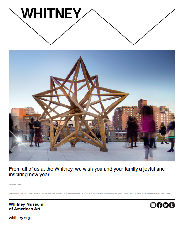
This kind of email can also be assembled quickly; an image and a line of text are all the elements that you need.
Design Tip: Find the right stock image and customize
- Need an image for your e-Card? Find one quickly and easily on free stock photo sites, then customize it to make it your own. The BEE editor is connected to three gorgeous stock photo libraries—Pexels, Pixabay, and Unsplash—so you can find the perfect image for your card when you design it. You can also customize the image with text right in BEE, and make edits with the built-in photo editor, Aviary. Make sure to check out our top tips for making sure your stock photos look fresh and on-brand.
Idea #3: Give your e-Card a CTA button
When it comes to adding a subtle CTA button, the business card company MOO did a great job of simply adding one to their New Year email, which was sent on January 1. It started with the subject line “Feeling fresh?” and included this fun animated GIF (which also kept the same theme as their happy holidays e-card):
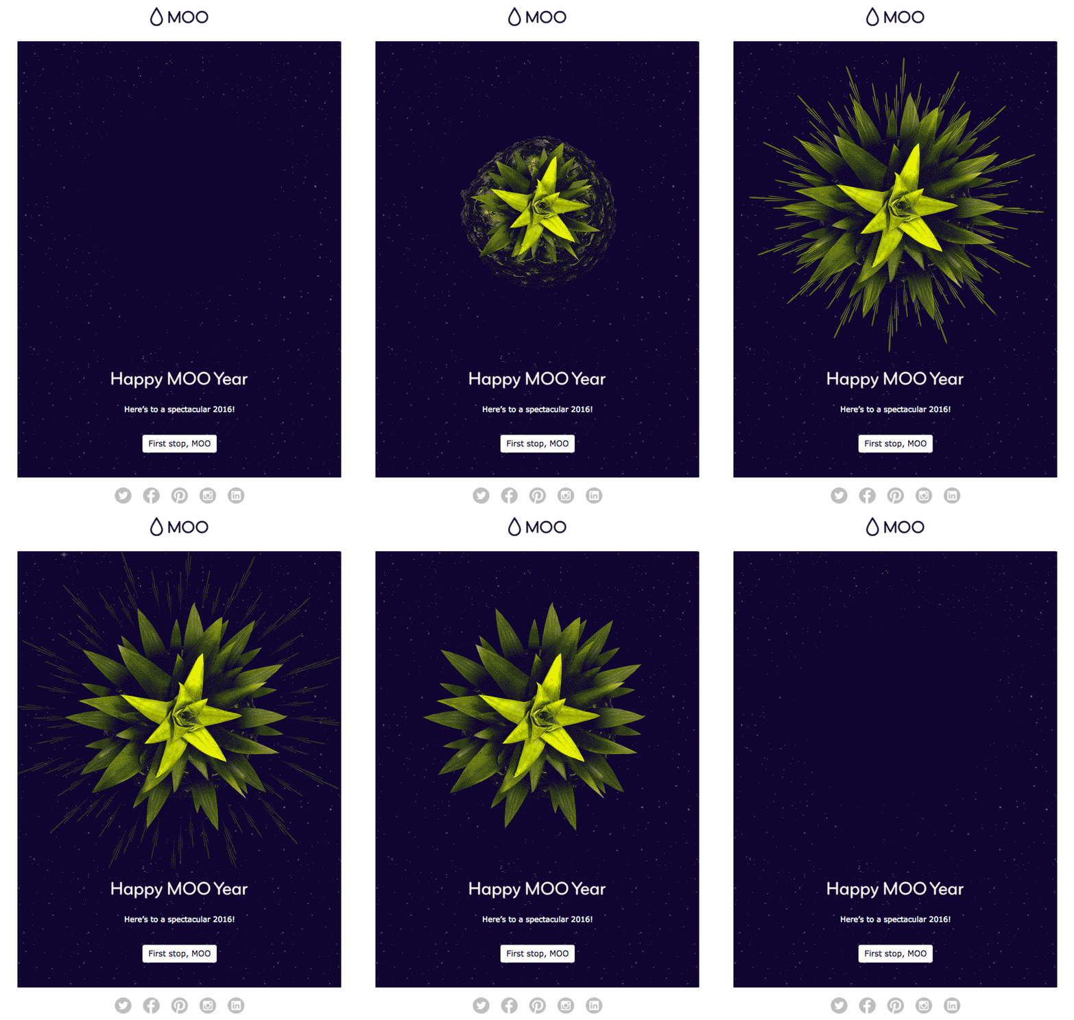
By customizing the CTA button text, MOO invites readers to shop without it being the message’s central focus. This friendly design is a fun way to ease readers into the new year while also entertaining them.
Design Tip #1: Make sure your GIF doesn’t overload inboxes
- For any email that includes an animated GIF, make sure it will be received the way you planned. Optimize your GIF—by reducing the number of frames and by being conscientious of size—to make it inbox-friendly. Check out our step-by-step tutorial on adding GIFs.
Watchmakers Daniel Wellington also included a CTA in their email. Even though DW is promoting its watches, the language used is decidedly not sales-y. Instead, the focus is on celebrating the New Year, while also suggesting (gently) that there’s no better time to buy a watch.
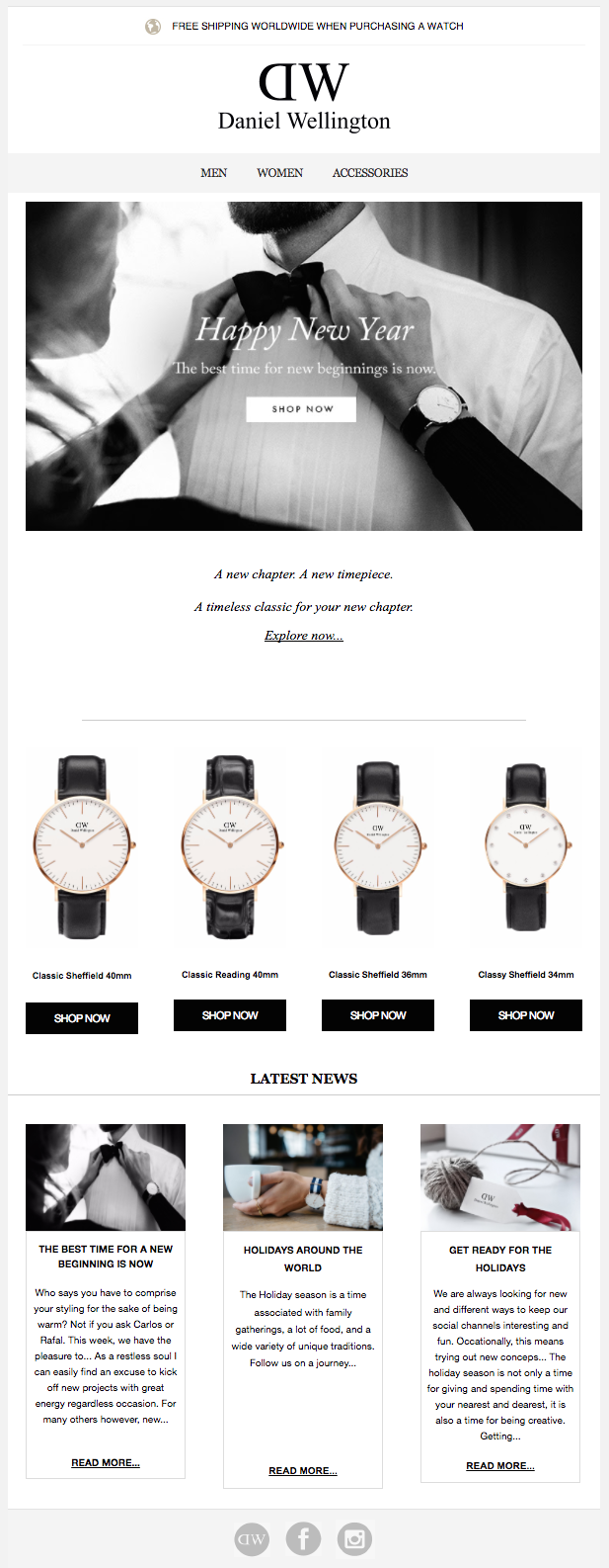
So if you haven’t already inundated readers with holiday promos and emails all month, this type of New Year email/e-Card might be a good option for you.
Design Tip #2: Don’t use images for CTA buttons
- CTA buttons are great—when they work properly. Don’t make a CTA button part of your image or its own separate image. Instead, layer a bulletproof button on top of a background image (see the design tip from Idea #1), or place it beneath your hero image. And learn how to optimize your CTA buttons for more clicks by using different colors.
Idea #4: Kick off a (really big) sale
By the time January 1 rolls around, there’s a good chance your customers are going to be all shopped out. To reinvigorate readers, some brands offer big sales events. A shipping incentive or a small discount might not be enough, so go big—like Black Friday big. That’s what Madewell did, by offering a huge 40% off sale styles campaign.
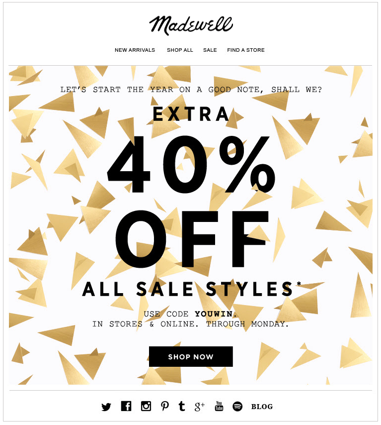
The design of the email is simple and festive. And the subject line, “Long night?,” followed by the pre-header text “This may help,” is a playful way to connect with how most readers feel when they wake up on New Year’s Day.
Design Tip: Give some thought to your subject line (and pre-header text)
- Have you tested how your subject lines are performing lately? We don’t need to tell you it’s a valuable practice. Most brands benefit from having short subject lines and asking a question to engage readers quickly. Just make sure your pre-header text doesn’t show up as “View on a web browser.” Take the time to customize it; make sure the first text to appear in your email body is an extension of your subject line.
Idea #5: Round up the 2017 bestsellers
Another way to motivate shopping-fatigued readers? Curate this year’s list of bestsellers. That’s what MAC Cosmetics did in this very simple three-column email.
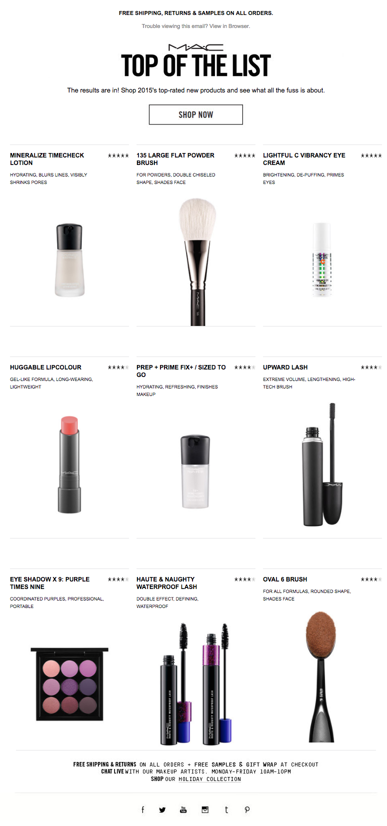
We love MAC’s clean, white layout, plus the inclusion of a 5-star rating system (something that definitely influences purchase decisions). There’s also no extraneous text; the images speak for themselves.
Design Tip: Make sure your photo galleries are responsive
- If you’re using a photo collage or gallery to showcase products, make sure those images look great on phones, too. Make sure the photos are mobile responsive, and that each image fills the screen as readers scroll through.
Idea #6: Send a collection of fresh content
If you regularly send content in your email campaigns (i.e. newsletters), you’ve probably prepared a New Year theme. A popular way to look back at the new year is to have a round-up of the past year’s best content, which is what Vimeo does. Here are the first few modules of their recent email (subject: The year’s best videos + milestones):
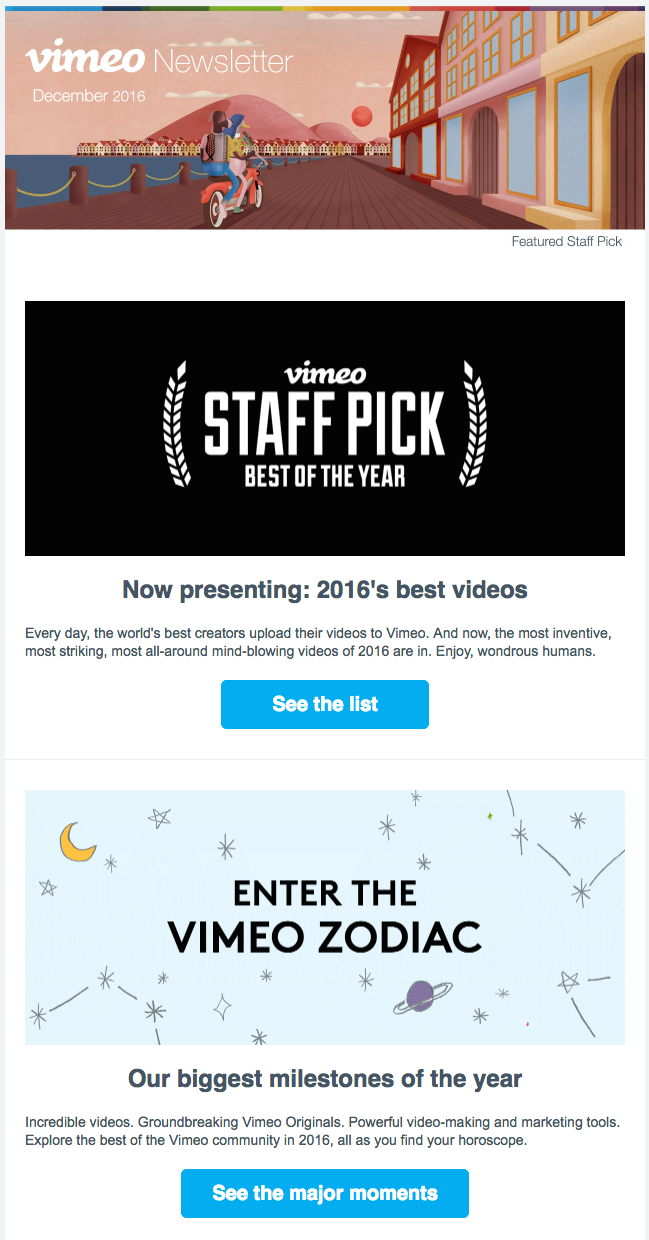
Adding company milestones is also a great touch. You get to pull back the curtain on what the brand is proud of, which helps readers connect with your vision and values.
Design Tip: Use consistent module formatting
- Make sure your newsletter modules follow the same structure. Vimeo uses the common inverse pyramid (header image, text, CTA button), which adds simple horizontal lines to break up sections. These techniques are subtle but really improve readability. Plus, once you design a module in the BEE editor, you can simply copy it to maintain the formatting in subsequent modules; this is a time-saving workflow hack and design best practice.
Idea #7: Say thank you
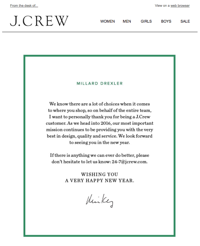
Sometimes, at the end of the year, the most important thing left to say is thank you. We’ve featured this note from J.Crew a few times now because we really appreciate the sentiment. A thank you email is a simple gesture, and just four or five sentences can go a long way.
Design Tip: Use borders and HTML background colors to complete your plain text email
- Even plain-text emails need a touch of good design to look professional and elegant. Add a border to your email, try centering your text, or include a personal signature to level-up your design—and turn your email into a holiday card!
What’s your New Year’s email going to be?
Let us know if you found our design tips helpful for designing your upcoming New Year’s email and feel free to add your own design tips in the comments below!
