All about Valentine’s Day emails, from creativity to strategies

With Valentine’s Day just around the corner, our inboxes are slowly filling up with pastel-colored emails with small hearts and bows. Nothing new under the February sun. Even if the tone can be a bit conventional, the forms and genres that brands are experimenting with in their campaigns are far from banal.
Today we wanted to discuss two sides of the holiday in our blog post: on the one hand exploring the different kinds of creativity that can be used for February 14th, and on the other hand exploring the different types of emails from a strategic point of view in order to provide a comprehensive look at Email Marketing dedicated to this holiday of love.
From developing integrations to strategic support, from creating creative concepts to optimizing results.
Creativity: 6 different approaches
1. The advertising/television approach
Let’s start from the most complex approach, as it involves shooting and editing work which is then concentrated in an animated GIF: a fundamental element that can give a impulse to dynamic emails. Here is a beautiful example taken from a Rosefield campaign.
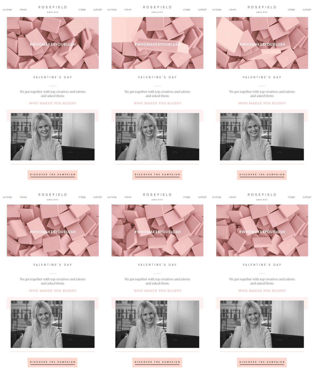
Among cascades of pink packages and smiling models, this GIF is a small advertising that has been adapted to the email format. It’s hard to find something with a better impact.
Originality: ★★★
Impact: ★★★★★
Product: ★
Difficulty: ★★★★★
2. The world of illustrations
Following an advertising/film approach, we move on to the stylized world of illustrations, which opens a brand up to an infinite number of expressive resources thanks to design, either graphic or freehand. Here is how UncommonGoods sees Valentine’s Day:
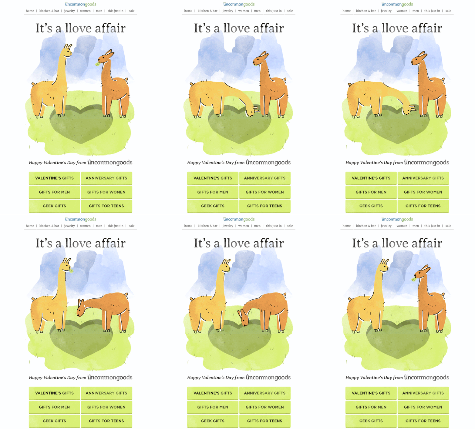
The unconventional choice of colors is noteworthy, which moves away from the classic Valentine’s Day tones, as is the pun in the header: llove affair (which references the subjects of the email: the two llamas).
Originality: ★★★★★
Impact: ★★
Product: ★
Difficulty: ★★★
3. Maximum yield, minimum effort
We started with two campaigns that are highly complex to create. When resources and time are more scarce, there are other types of creativity that, albeit not obviously, blend well into an invitation to find out more details about an offer.
Terme di Saturnia is a great example:
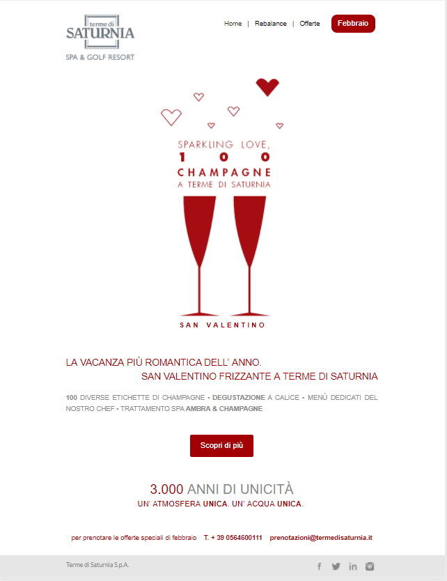
The email contains a simple illustration that works like a business card with the theme of Valentine’s Day.
Originality: ★★
Impact: ★★★
Product: ★★
Difficulty: ★
4. 50% creative, 50% product
In the campaigns we have used as examples so far, you may have noticed that there are no products. It’s almost paradoxical. All three campaigns ask the recipient to click within the email in order to view images of the offer. But product and creative can be combined without necessarily having to create a catalog showcase. Estée Lauder does it very well:
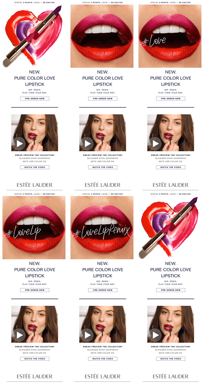
The brand has found the perfect middle ground between product suggestion and a style of creative that inevitably catches your attention. Or rather, the product becomes a tool, and the brush and color bring the creative to life: the symbiosis between product and creative is 100% here.
Originality: ★★★
Impact: ★★★★
Product: ★★★★★
Difficulty: ★★★
5. The photographic approach
This type of creative aims to display a showcase of products to recipients, focusing on putting them in clear view and presenting them, rather than on the impact and surprise introduced by specific creative.
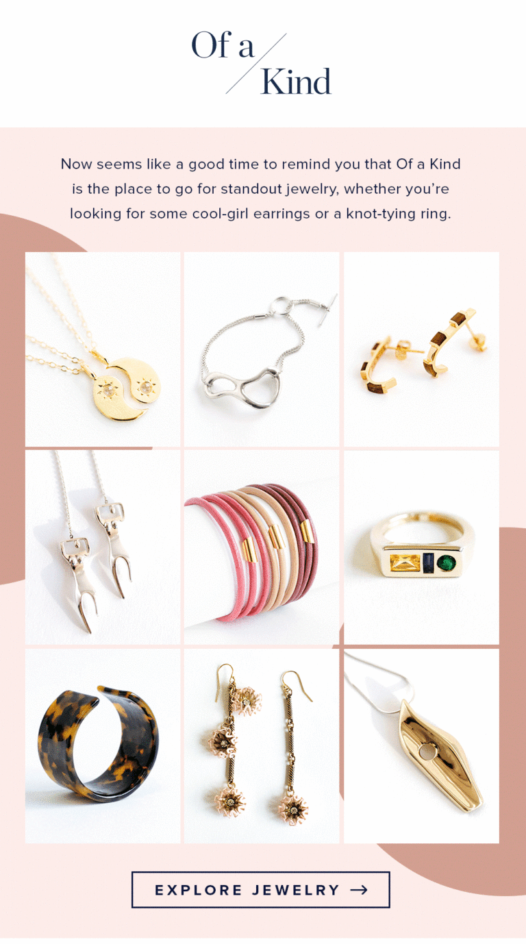
This email from Of a Kind has a focus on the jewelry, and the creativity is limited to a discrete but effective animation (a simple GIF).
Originality: ★
Impact: ★★
Product: ★★★★★
Difficulty: ★★
If the previous email is a true “email-showcase”, this email from Mejuri sends recipients to the company’s photographic catalogs.

An entirely photographic approach: so much so that this email looks like it was taken from a fashion magazine. The copy is consequently limited to captions, while the calls to action are the only elements that stand out beyond the images.
Originality: ★★★
Impact: ★★
Product: ★★★★★
Difficulty: ★
6. Playful
When it is most successful, “creative” in marketing means playing with the speaker. Many people would say it was inconceivable to involve people with a one-way channel such as email, yet here is an example that triggers an interactive/playful element in a campaign:
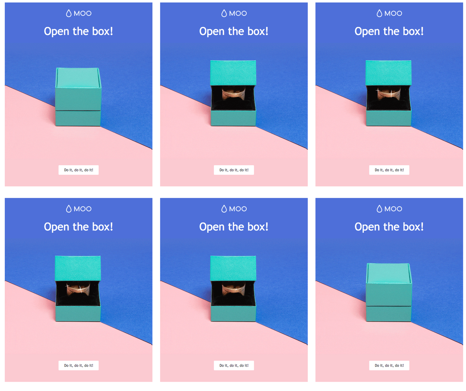
By now we are used to MOO‘s brilliant emails. It may be the brand that best combines playfulness, creative, and dynamism. And as you will likely imagine, all this leads to very high click rates.
Originality: ★★★★★
Impact: ★★★★★
Product: ★
Difficulty: ★★★
Strategy: 6 activities for maximizing conversions
1. Flash sale
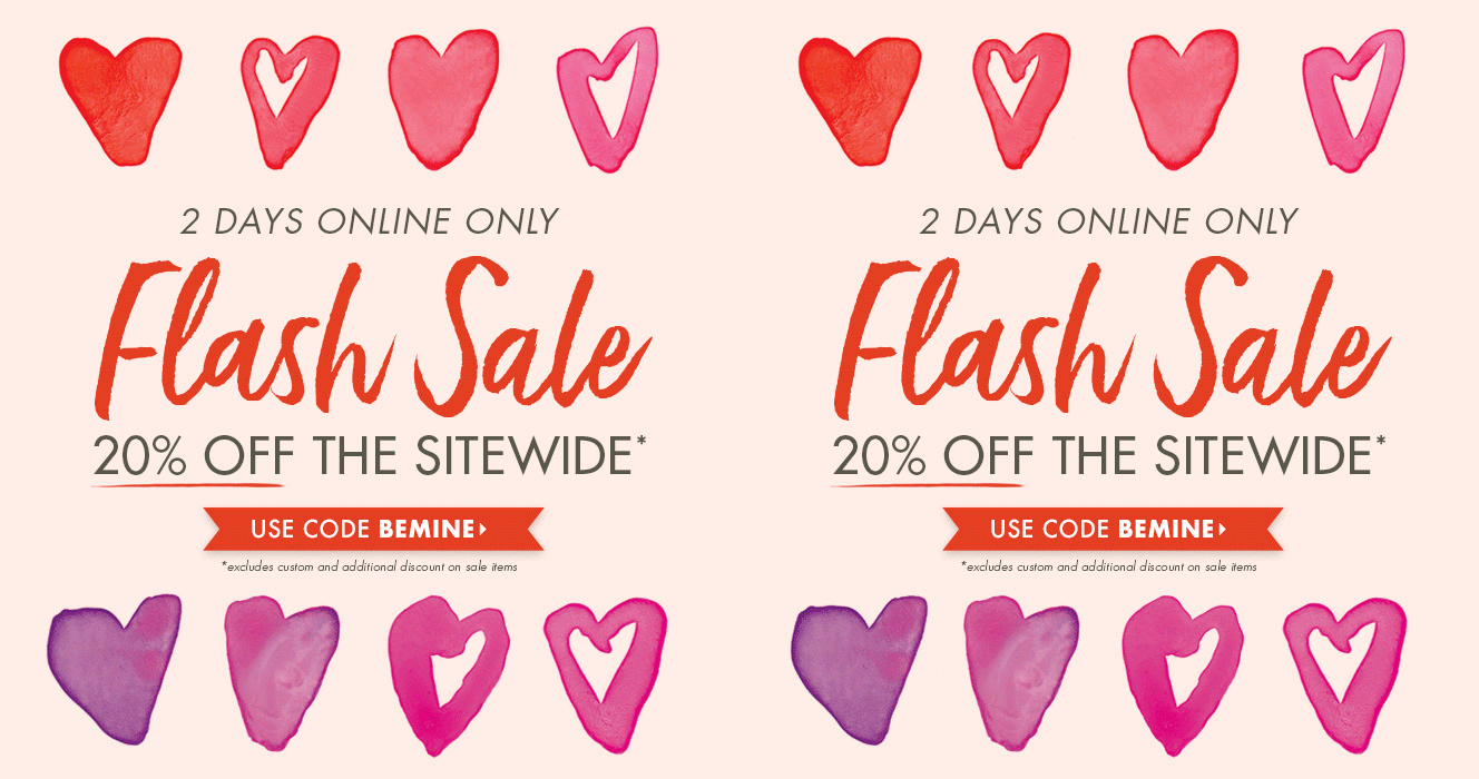
This type of transversal campaign is good for every occasion because it focuses on an advantage for the recipient. And when it is connected to seasonal logic (in this case Valentine’s Day), the advantage becomes even more concrete.
Here is an example of an email focusing on a flash sale: there are hearts, there is a dynamic element, and the copy couldn’t be any clearer or more direct. It doesn’t have anything particularly original, but it is certainly reliable and effective in communicating a discount coupon.
2. Exclusive Valentine’s Day collection
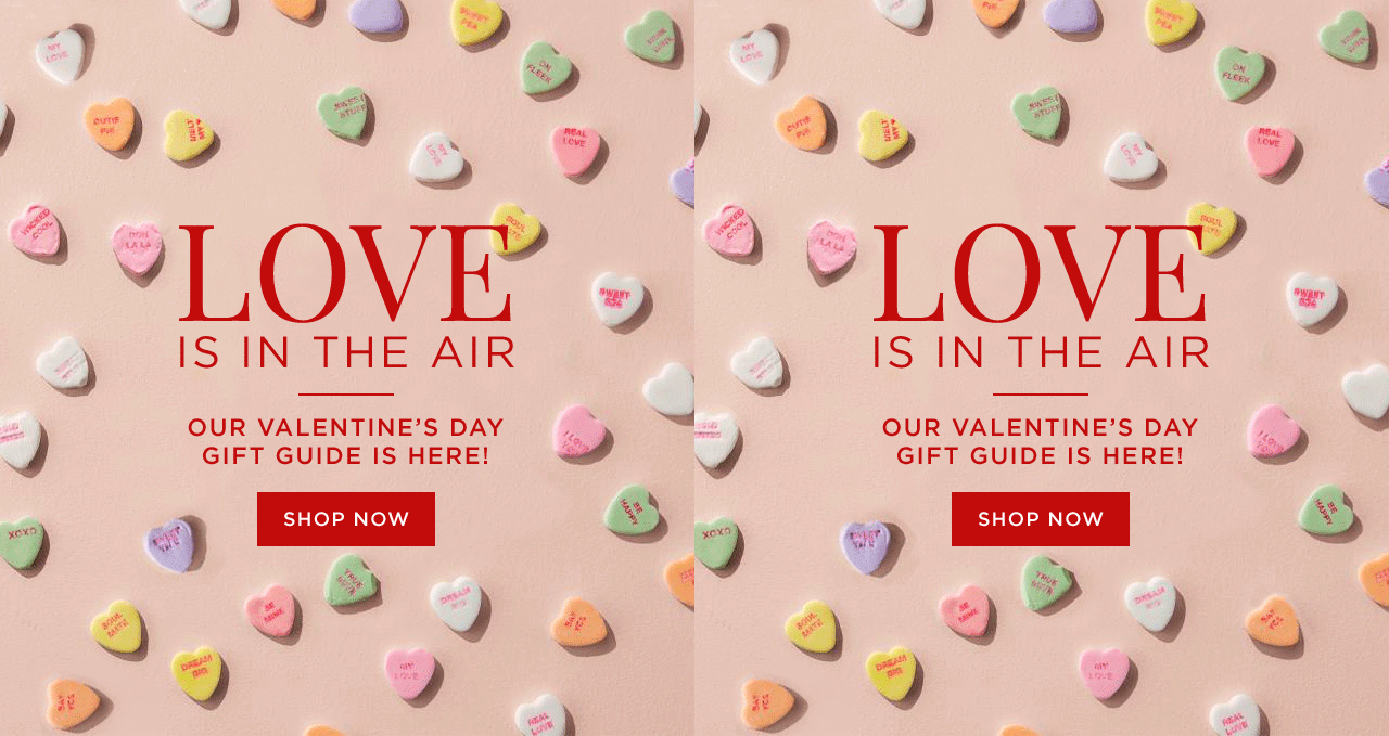
If you have a product line just for February 14th, email lets you present it in the best way possible. Without necessarily having to crowd it with too many product images, you can create a sort of flyer that introduces the offer and sends the recipients to check out the articles on your site in a single click.
The example below has all the right ingredients to attract and intrigue recipients.
3. Unique pieces
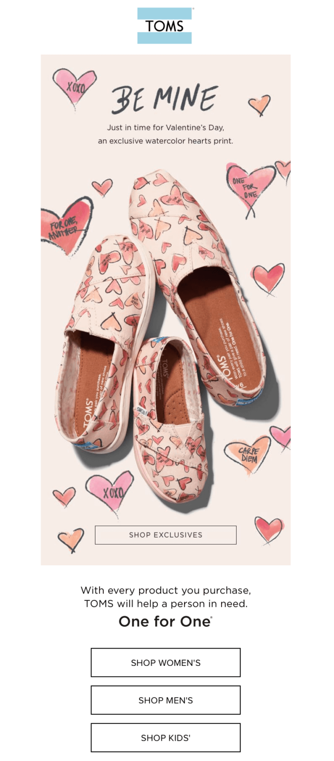
Connected to the previous strategy, this one relies on singularity rather than on the variety of an offer: the creation of unique, ad hoc pieces whose availability is limited to the weeks around Valentine’s Day. Toms did this very well last year, creating a pair of shoes full of small hearts and love messages.
4. Segmentation ⇾ Customized emails
Valentine’s Day is not a transversal holiday like Christmas: your database will never be entirely composed of lovers in their twenties. Sending the same email to everyone can also be counterproductive and lead to an increase in unsubscribes. This dynamic is due to the email’s irrelevance.
Segmenting means separating your database into clusters of recipients: those to involve in a send, those to exclude, and those to send a specific offer to rather than another.
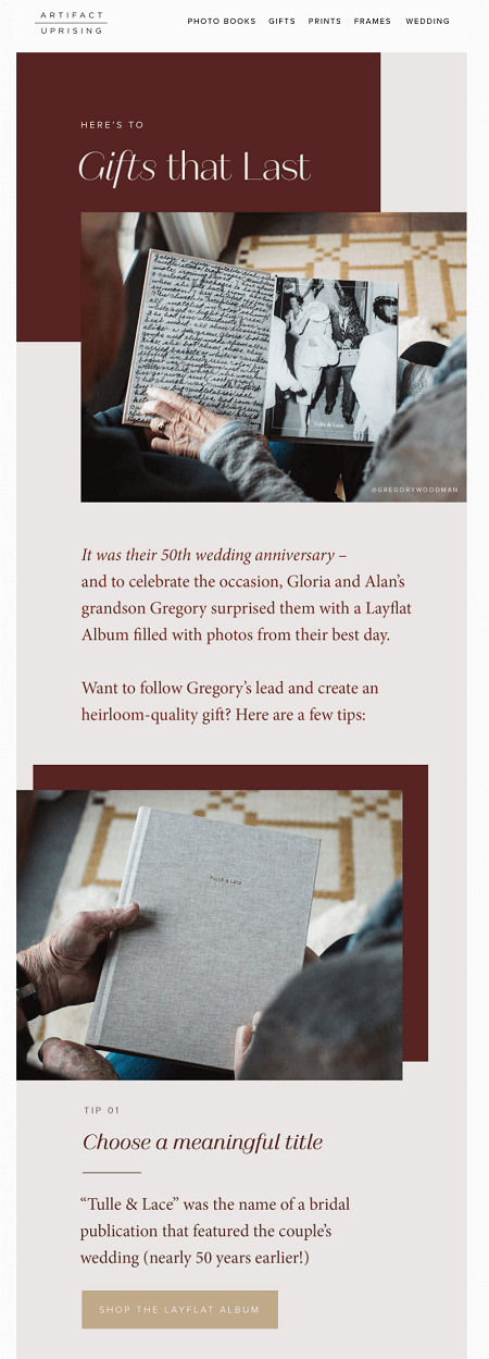
Here is a beautiful example of a campaign which took advantage of segmentation: Gregory Woodman created a segment of contacts which are (presumably) over 50, sending them an offer on albums for photographs and memories.
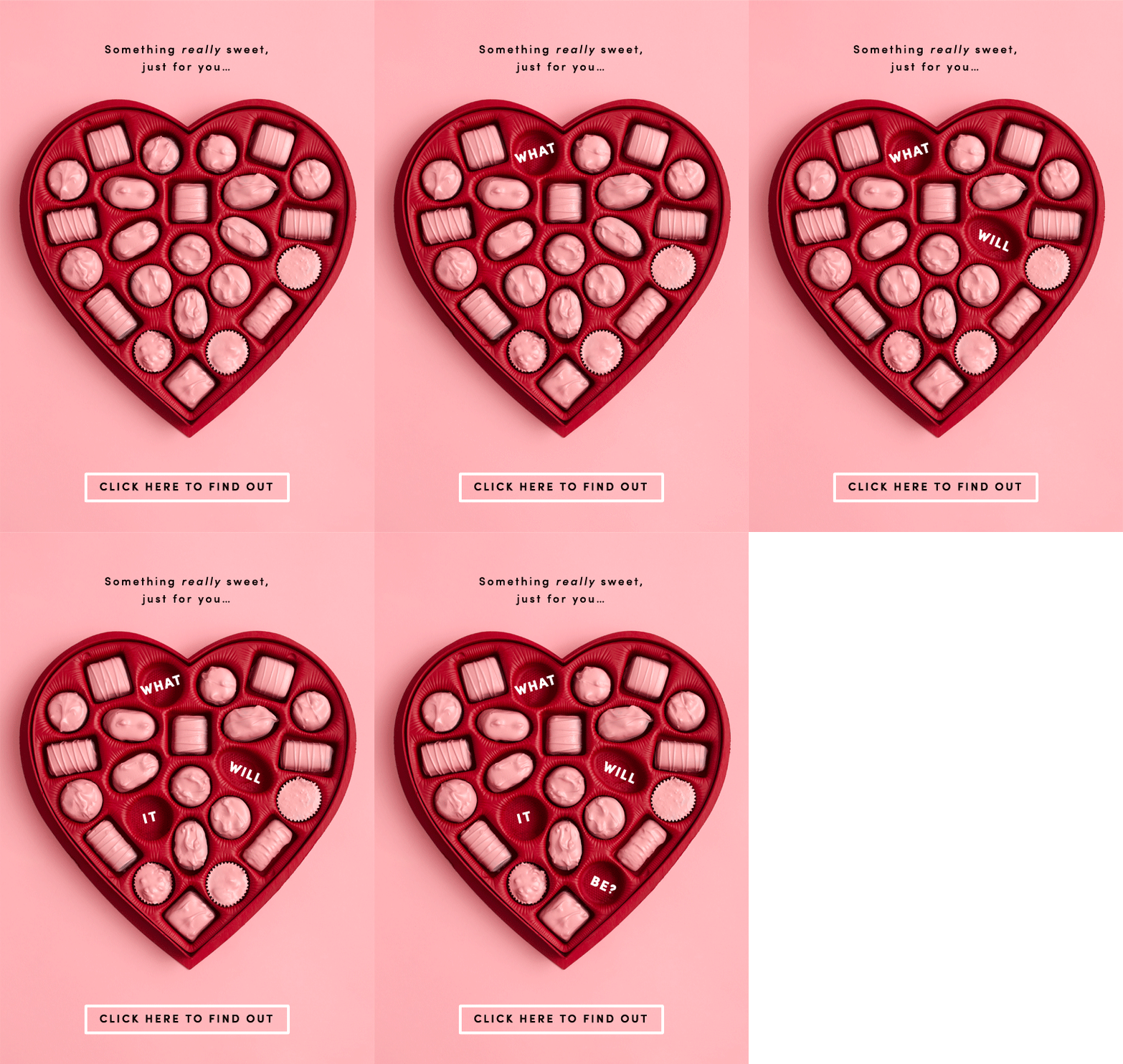
Here is one more example of ad hoc campaigns that was created specifically for singles, with concept such as “Something just for you”.
5. The teaser guide
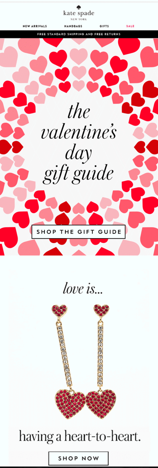
Minimal and straight to the point. It does not describe, but tempts readers to click, tickling their curiosity. This guide is nothing but a poster or teaser, indicating what the recipient will find on the site. The important thing is not to go unnoticed. A minimal message is effective if accompanied by a visual output that impacts. Kate Spade provides an excellent example:
6. Retargeting to convince the indecisive
Has your recipient clicked on an email multiple times without making a purchase? You could be dealing with the classic indecisive profile, that (widespread) type of customer who waits until the last second, then orders something in a panic. To help them avoid stress and confusion, let them know that all is not lost, reminding them of the product with an email that states the deadline for ordering to receive it by February 14th.
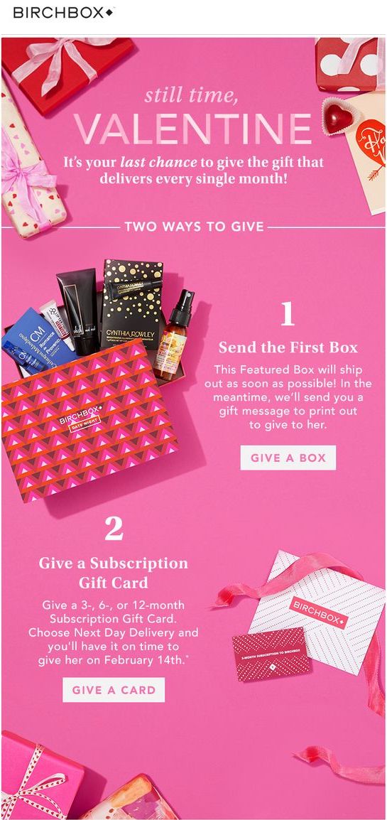
This Birchbox email reminds customers that there is not much time left to purchase something, offering two last-minute gift options to help them avoid winding up empty-handed. Keeping with the theme, it is a gesture of love for the chronically indecisive.
In conclusion
Strategies and tools are necessary in order to do all this. The former can be learned from our blog and all our other resources, while the latter require technology.
That’s why if you haven’t yet, we invite you to try MailUp. You can try the platform for free for 30 days if you request a trial.
