Email & Mobile: all you need to know about responsive design
There is a fact that we all know by now, that we have all memorized: nowadays almost half of all emails are opened on mobile.
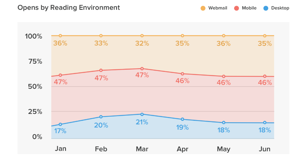
The percentages oscillate around this figure every year, but with a constant, gradual increase. Let’s look at the data updated in June 2018 (source: Litmus Email Client Market Share Trends): mobile openings amounted to 46% of the total, those from webmail amounted to 35%, and desktop to 18%.
If this were not enough, we have further information that makes the issue an opportunity, an advantage: the Impact of Mobile Use on Email Engagement study found that the unique clicks among mobile device users on responsive emails have increased from 2.7% to 3.1%, with an increase that can be quantified at 15%. This means that by optimizing mobile emails, you can achieve a real increase in clicks on campaigns and, consequently, conversions.
Greater usability → More clicks → More conversions → Greater ROI. Elementary, no? Not really, because the mobile responsive field is more articulated than you think, and involves multiple actors and variables. Let’s make sense of it.
From developing integrations to strategic support, from creating creative concepts to optimizing results.
Technical email design dictionary
What is the ultimate goal of mobile optimization? Provide content (email) that has the same effectiveness in “difficult” contexts such as those imposed by mobile, which include:
- Little screen space
- Fast and intermittent use
- Precarious or slow internet connection.
With that introduction, let’s start by clarifying some basic definitions:
Scalable email design
This is characterized by a simple layout (which most of the time consists of a single scalable column for all screen sizes); large and captivating text; big call to action buttons. It is the technique that guarantees the “least effort and most yield.”
Fluid email design
Its difference from scalable design lies in the fact that fluid design fills space as if it were fluid, making the display dependent on the size of the device chosen by the user. This is the most suitable technique for emails with large volumes of text.
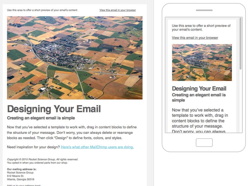
Mobile-friendly email design
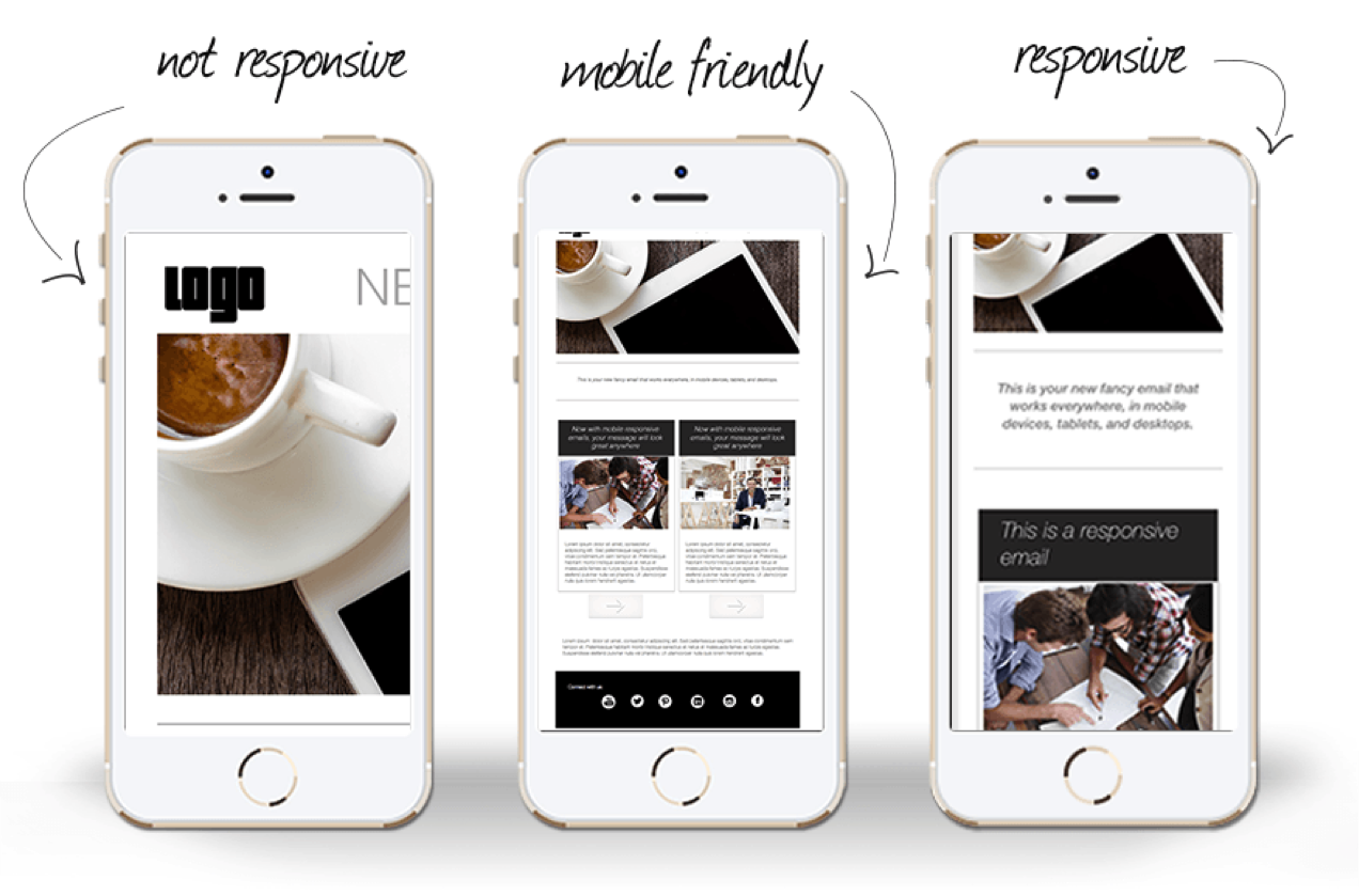
It does not rearrange the content grid: it simply ensures that content is fairly readable on screens of various sizes. This type of email is not yet properly optimized for all types of devices.
Non-responsive email design
This means that when emails are opened on mobiles, they do not undergo any resizing, making it extremely inconvenient to use, with continuous scrolling down and to the right.
Mobile-responsive email design
The most correct and complete, able to guarantee optimal visualization on screens of any size. The content of the message adapts to the width of the screen, according to rules dictated by CSS media queries.
Modular email design
This means building email through content blocks and not fixed structures. Content blocks (or modules) are reorganized based on a different grid depending on the media query detected at the moment.
To create responsive emails, you do not need to know HTML!
All you need is an email editor: try BEE!
Call to action: the right position for mobile
Make the button visible upon opening
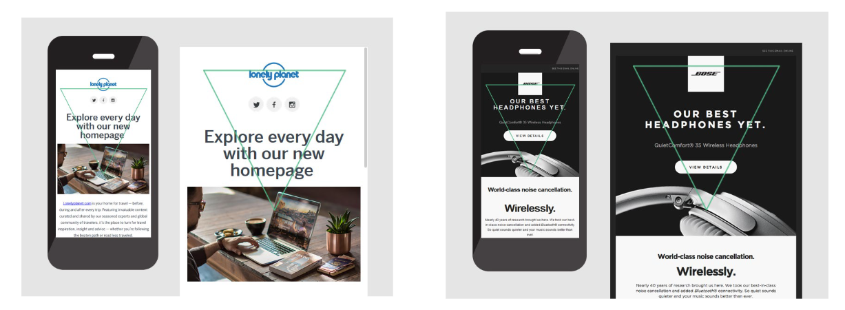
Recipients interact with smartphones and emails in precise ways. The majority use one hand, with the thumb to interact with the screen and the other fingers to support the smartphone. It would therefore be perfect to have the button visible without needing to be scrolled to, if not placed directly at the top of the screen.
Play with the button
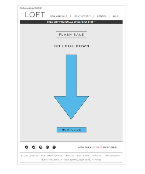
There are also brands that play with the button, placing it (almost provocatively) away from the header. Objective: to create engagement, interaction, to trigger a playful dynamic. Here is an excellent example:
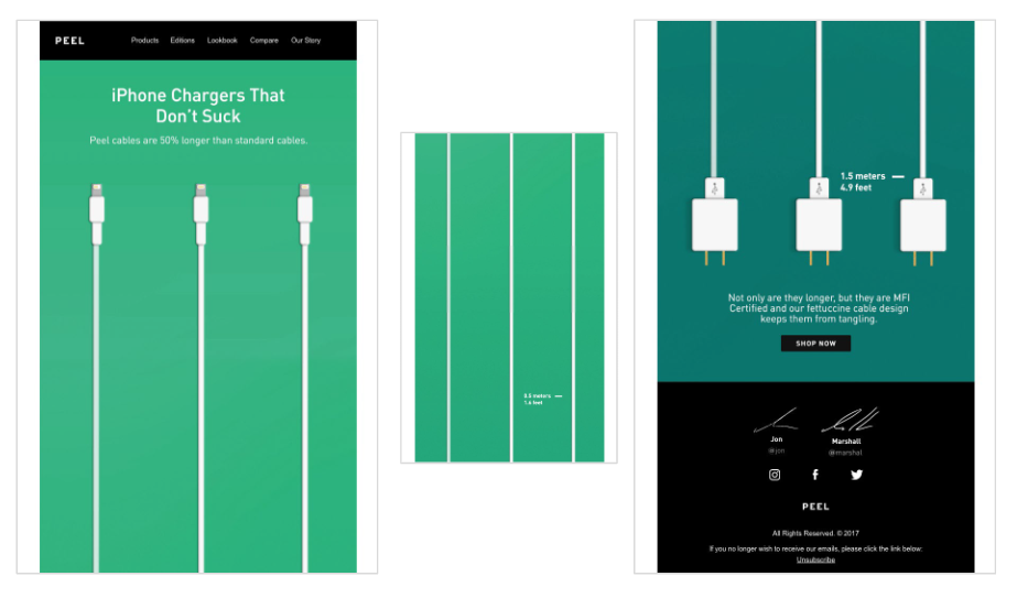
In the same playful perspective, Loft has focused its message on an ostentatious invitation to click, ironically on this key dynamic of email marketing.
Create a bulletproof button
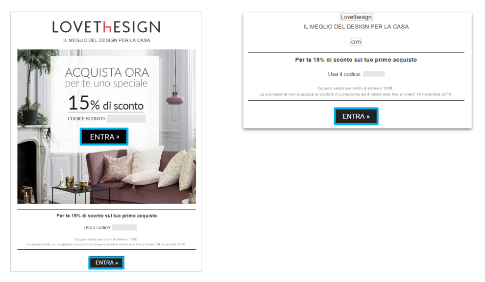
Bulletproof indicates a graphic element written in HTML, whose visualization cannot “break” under any circumstances. The great advantage of bulletproof design is that it is displayed and works correctly in any mailbox, as it is not an image.
Do not create text buttons
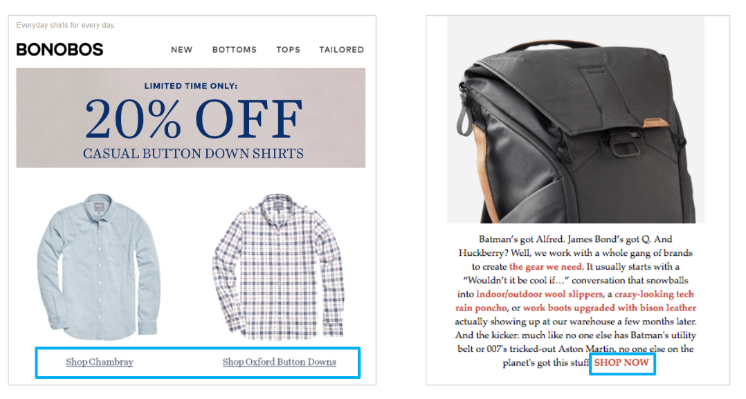
Sometimes the call to action can also be text instead of a button. However, this option is not advisable in mobile view, since a string of text (albeit well-highlighted with color and bold) does not stand out enough overall.
Perform A/B tests on the different elements
An A/B test is a tool that lets you compare two versions of the same message and define a winning version (for opening, click, and conversion rates). Applied to the call to action, an A/B test lets you compare:
- Copy (1st/2nd person, specific/generic, etc.)
- Color
- Size
- Forms and effects (smoothing, shading, etc.)
Image rendering: optimizing weight, size, and avoiding critical issues
Weight: a few recommendations
How much are we willing to wait for a web page to open? According to Kinsta, 74% of users leave after 5 seconds, while Soasta’s data tells us that conversions already begin to fall before 2 seconds.
This is why it is essential that the images are light enough to be quickly downloaded, while also safeguarding their resolution. Always remember to:
- Save images in JPG, GIF, PNG format
- Maintain a maximum weight of around 50 KB
- Ensure that the image resolution is 72 dpi.
Dimensions: never exaggerate with either too much or too little
Images which have been created for entirely different purposes – for an advertising campaign or website – are often inserted in emails. Without the appropriate measures, the dimensions will not be optimal or functional to the message.
Here are our recommendations:
- Always cut images, customized for emails
- Save all images in the same folder, so as to have the same source and more control in case of modifications
- Do not fix images’ dimensions, but leave them fluid inside the frame they are placed in, allowing the structure of the communication to “shape” the image.
Alt text: never forget it
Always keep in mind that some mail clients, by default, do not display images, and that for some reasons some users prefer to disable them: in these cases many emails are irreparably compromised.
A key buffer to this problem is to insert the alt text property in the HTML code, which defines the text to be displayed in case the image is not loaded.
Our recommendations:
- Make sure that the most important images always have the alt attribute
- Do not exceed the inserted text, it could ruin your communication’s layout
- Make sure that the color of the alt text (for size and color) is easily readable
- Preferably leave the alternative text underlined with a link so that its function is easily recognizable.
Image-only emails: taboo
Image-only emails are those which have been created as a single large image that includes text and call to action buttons. This is a dangerous option, because these emails often end up in spam folders; furthermore, they are not optimized for mobile devices and may not be completely downloaded.
Always keep in mind that to be effective, emails must have a balance of images and text (at least 500 characters of text).
Colored backgrounds: the best complements to images
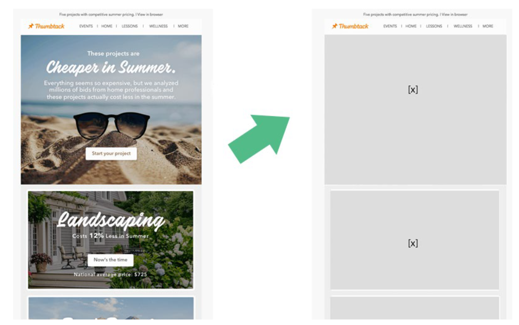
Background colors can organize content, establish hierarchy, and when used behind images, can reinforce your design even with image display disabled.
In addition, HTML background colors are displayed on all mail clients (unlike images). If on desktop it is more evident, on mobile a colored background has less prominence, and is often only displayed in the gap between one block and another, as in the example.
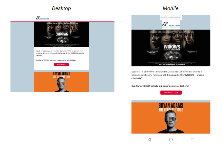
Let’s take a look at some suggestions for background colors.
Match background color to images
The colored background comes to the rescue when the recipient’s mailbox is blocking images. Here’s how the background helps this email from MOO:
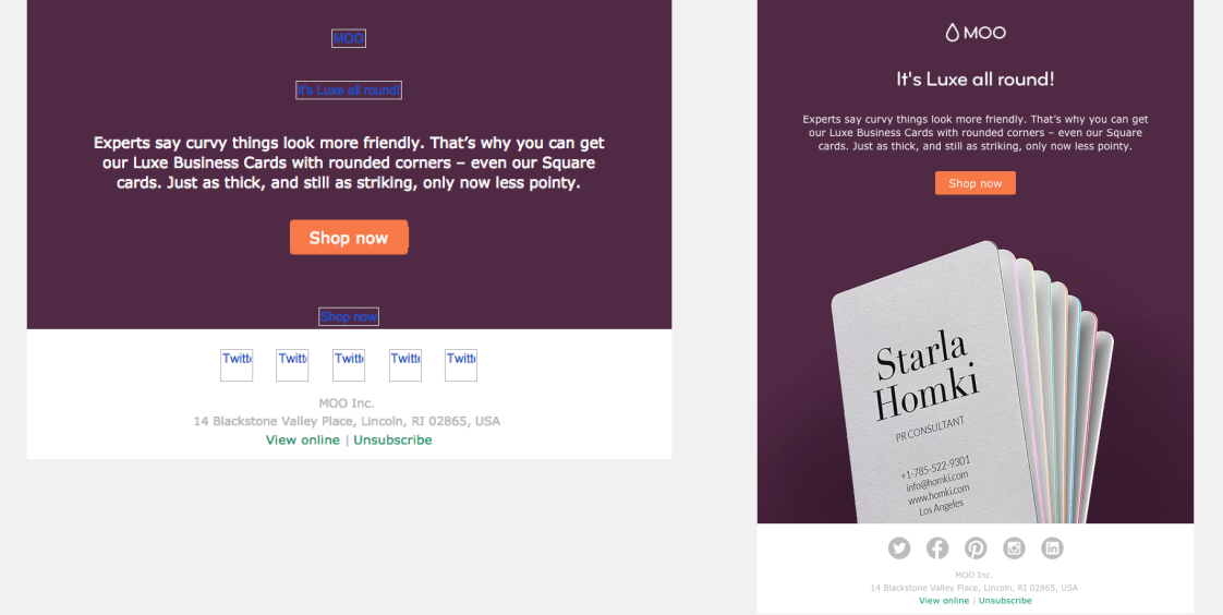
The background makes it possible to give the email visual integrity even when the images are disabled. To achieve this, make sure that the background color of the images and the HTML background color are identical.
Choose a light, prudent tone
Moving away from the typical white background is a choice to be evaluated carefully, because color significantly influences the impact on readers: according to TruConversion data, 90% of the judgment on a product is based exclusively on color.
Brands that take better advantage of the background opt for a light shade.
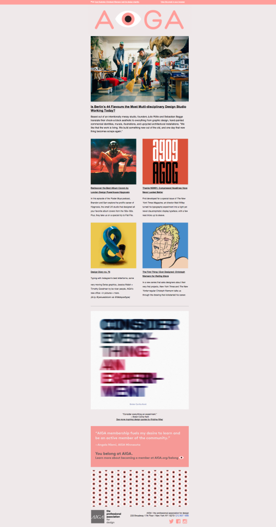
Separate blocks with different background colors
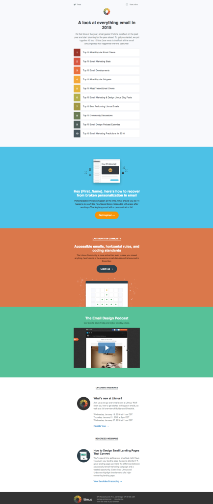
A great way to take advantage of the background is to set a different color for each email block, marking the separation. This technique has always characterized Litmus emails:
Checklist
? Always think in a mobile perspective
Before creating your email, reflect on the most functional arrangement for the recipient to scan and use the contents.
? Create emails with the BEE editor
Unless you are an HTML and CSS expert, rely on an editor like BEE to create modular and responsive emails with simple drag & drop operations.
? Insert readable but quality images
Keep 50 KB as a reference weight and, at the same time, make sure that the resolution of the image you are inserting is 72 dpi.
? Insert on-page text and CTAs
Never create the whole email as a single large image: insert text and buttons as elements on the page, so that they are resized to be readable from mobile.
Now you have everything you need to start creating responsive and impacting mobile campaigns! Just request a free 30-day trial on the platform.
